Design is not decoration. It is the thing your customer reaches before they reach anything else you have built, written or priced. And it does most of the persuading before a single word gets read.
That is why design matters. Not because beautiful sites win awards, but because design is doing real work on your bottom line. It is deciding whether someone trusts you in the first two seconds. It is deciding whether they keep scrolling or close the tab. It is deciding whether they think you are the safe choice, the expensive one, the unserious one, or the obvious one.
If you treat design as a cosmetic layer, you are treating one of the strongest commercial levers you have as an afterthought. That is the position this article wants to undo.
Design Is a Business Outcome, Not a Visual Preference
Design is the way your business is organised, presented and made usable for the people you want to buy from you. It works by shaping perception, reducing friction and signalling competence before your content has a chance to do any of those things itself.
Strip away the language of taste, and you are left with a commercial question. Does the way this site looks and works move people closer to buying, or further away?
According to Fogg et al.’s Stanford study of over 2,500 participants (2003), the “design look” of a website was the single most-mentioned factor in how people judged credibility, appearing in 46.1% of their comments. It ranked above information structure, brand recognition and content itself. The visual was not a tiebreaker. It was the front door.
That research is now over twenty years old, but the underlying behaviour has only intensified. The bar has risen. Visitors compare your site against every other digital experience they use, and most of those experiences are now run by companies that take design seriously. If yours does not, the gap is the thing they notice.
Design the quiet force in the funnel, silently shaping every step and amplifying benefits across the entire business
Why Design Matters to Your Business
Your customer is not reading. They are skimming, scanning and pattern-matching against every other site they have used today. Banks. Streaming services. Whatever app they opened on the train. The bar has been set by companies that spend serious money on the experience, and your site is being measured against it, whether you like it or not.
When a visitor lands on your page, they are running a fast and mostly unconscious test. Does this look credible? Is this current? Does this look like someone who knows what they are doing? They are not articulating the questions. They are feeling the answers.
Good design answers yes to all three in well under a second. Bad design answers no, and the visitor leaves before you have had a chance to say anything.
There is a knock-on effect on price perception as well. A confident, considered design tells the market you are confident and considered. A cluttered or dated design tells the market the opposite, and the offer that follows is read in that light. The same service, presented two ways, will not return the same lead quality or close at the same rate.
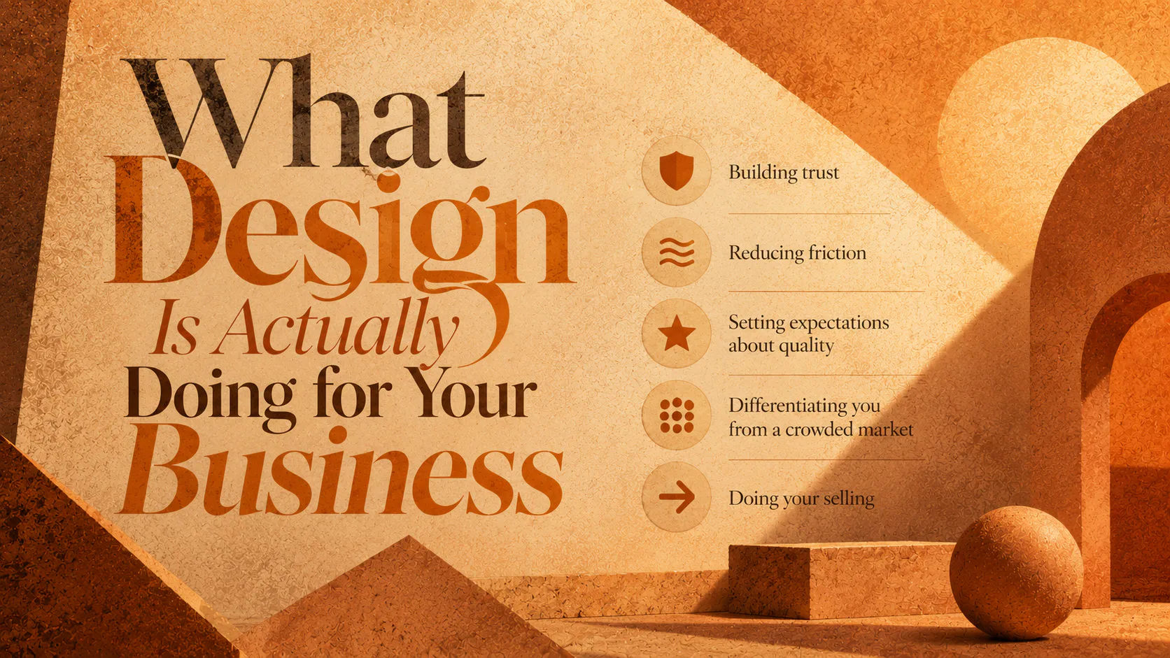
What Design Is Actually Doing for Your Business
Be specific about the jobs that design is doing while you are not looking.
Building trust. Visual cues like typography, spacing, image quality and consistency are how a visitor decides whether you are a real, established business or a side project. None of that is conscious. All of it lands.
Reducing friction. Good design removes effort. The visitor finds what they want without having to think. Bad design adds effort. Every extra moment of confusion is a chance for them to leave.
Setting expectations about quality. People assume the inside matches the outside. If your site feels rushed, they will assume your service is too. If your site feels considered, they extend that assumption to your work.
Differentiating you from a crowded market. In most industries, the products and pricing across competitors are closer than anyone wants to admit. Design is one of the few honest differentiators left.
Doing your selling. Hierarchy, layout, imagery and flow are how a visitor is guided from “what is this” to “I want to talk to them.” That is design as a sales function, not a finishing touch.
A site can be technically fine and still be doing none of these well. That is the gap most businesses do not realise they have.
How Poor Design Costs You, Specifically
The cost shows up in three places.
The first is bounce rate. According to Think with Google, as page load time increases from one to three seconds, the probability of a mobile visitor bouncing increases by 32%. From one to five seconds, it increases by 90%. Design and performance are linked. Heavy, badly built sites both look and feel worse, and lose people for both reasons at once.
The second is conversion. Visitors who do not trust what they see will not give you their email, book a call or buy. The drop is invisible because you never see the leads you did not get. The site just quietly underperforms.
The third is brand. Every visitor who left because the design was off is a person carrying an impression of your business out into the world. Some of them tell other people. All of them are harder to win back the second time.
You will not see any of this on an invoice. But the costs are real, and they add up.
Why Does Website Design Affect Conversions?
Website design affects conversions because it shapes how confident a visitor feels about taking the next step. Confidence is the single biggest predictor of whether someone clicks, calls or buys.
Design influences confidence in three ways. It signals legitimacy through visual quality. It reduces effort through clear hierarchy and navigation. And it sets the tone for the offer that follows, so the same product feels like a stronger purchase on a well-designed page than on a poor one.
This is why two businesses with the same product, the same pricing and the same traffic can convert at very different rates. The site doing more work is converting more visitors.
The Difference Between Pretty and Effective
Not all good-looking design is good design. This matters because plenty of sites are visually polished and still commercially useless.
Pretty design is concerned with looking nice. Effective design is concerned with doing a job. The job is moving the right person from arrival to action with the least friction possible. A site that wins design awards but fails to convert is not doing its job. A site that converts well but looks dated is leaving money on the table by undermining its own credibility.
The work is to get both. Effective and considered. Useful and confident. Designed for the customer’s decision, not the designer’s portfolio.
This is also where templates start to fall short. A template can give you pretty. It cannot give you a design system shaped around your specific customer, your specific offer and your specific positioning. The further you grow, the more that gap costs you.
What Good Design Looks Like in Practice
A few markers worth knowing.
Hierarchy is clear. A visitor knows where to look first, second and third without having to work it out. The thing you most want them to see is the thing they actually see.
Typography is doing its job. It is readable on every device, it has personality without being theatrical, and it makes long content feel inviting rather than punishing.
Imagery is intentional. Photography or illustration that fits the brand, not stock images that could appear on any site in any industry.
Whitespace is generous. The site is not trying to cram. It trusts the visitor to scroll, and rewards them for doing it.
Mobile is not a compromise. The site is designed for the phone, not patched onto it.
Performance is part of the design conversation, not a separate one. Speed, weight and accessibility are design decisions, not engineering footnotes.
None of this is complicated. It is just regularly skipped on sites that are losing customers.
How to Tell If Your Design Is Working
Ask three questions.
Does the site convert at a rate you would expect for your traffic and industry? If not, design is one of the first places to look.
Do your customers tell you the site reflects the business they encountered after the call? If the gap is wide, the site is underselling you.
Does the site still match where your business is now? If you have grown, changed direction or moved upmarket and the site has not kept up, it is working against you.
A proper design review is more than a checklist, but those three questions are usually enough to tell you whether the conversation needs to happen.
Design is not the icing. It is closer to the foundations. If yours is not pulling its weight, the rest of your business is working harder than it should to make up the difference.
If you are unsure whether your site is helping or hurting your business, that is worth a conversation.