Website design relates to the overall look and feel of a website. Web design also refers to the process of creating a website with a focus on its appearance and usability.

A web designer’s goal is to create a website that is visually appealing and easy to use.

To create a beautiful website, web designers work on the layout, typography, images, and colour palettes.

Apart from making sure that all the visual elements come together, designers also have to consider how all the elements they use will affect the website’s usability and performance (loading speed).

A well-designed website creates a lasting first impression on visitors and can help build trust for the company/brand and nudge them into action.

What Makes a Good Website Design?

Website Design Elements

Some people may think that website design is all about visual aesthetics. While making the website pleasing to the eyes is crucial, other factors come into play in web design.

Elements of a Good Website Design

Fit for Purpose

Before jumping into the details of what colour schemes or best fonts to use, web designers must first understand the purpose of building a website.

The goals of the client for the website must be clear from the start. Will the website be used for generating leads? Selling a product? Promoting the brand?

Likewise, the demographics, needs, and preferences of the intended audience must be taken into account.

Only then can the web designers determine what website design features and functionalities will be effective to achieve the set goals and accommodate the target users’ needs.

Overall Appearance

It takes just less than a second to capture the attention of your website visitors. If they’re not impressed, they will readily get out of your site and find another one that they like. That’s how important it is to get the look and feel of your website right.

All the visual elements must come together to create a website that is easy to read, leads the readers to the most important information, and is visually appealing.

Layout

A well-designed website must have a good structure and a well-defined layout. This refers to how the text, images, videos, and other elements are arranged on the page.

There are many web layout trends out there like parallax, grid, asymmetry, split screens and others. Each layout trend has its advantages. Effective web layouts have these things in common:

  1. Simple and intuitive to use
    The website is easy to navigate and the users can immediately find what they are looking for.
  2. Streamlined
    The less visual clutter, the better. The use of lots of white or negative space and fewer elements on the page helps the user focus on the most important parts of the website (for example the flagship product and/or calls to action).
  3. Easy to scan

    Your visitors will scan the content of your website first to determine if it is useful to them before actually reading it. If your page has long continuous text, your visitor will be discouraged to scan/read it and just abandon your site.

    It is primarily the content writer’s job to ensure that the content is divided into manageable chunks under headings, subheadings, and bulleted lists. But it is up to the web designer to arrange text and images on the page and use appropriate colours, fonts, contrast, spacing, and negative space to ensure the scannability of the page.

  4. Responsive
    Responsive websites will look great regardless of the device used (desktop, laptop or mobile) and the orientation (portrait or landscape) of the device.
Typography

Typography refers to the art of arranging letters and text including the selection of fonts, kerning, leading, tracking etc.

Typography matters in web design because:

  1. It helps establish visual hierarchy.
    Visual hierarchy is the principle of arranging text and images on the page according to the order of their importance or how you want the users to view them. Typography is just one of the ways web designers establish visual hierarchy. Designers can pull focus on a certain area of the web page by choosing the appropriate font sizes, weight, colour, and alignment.
  2. It can impact readability.
    Font size, weight, colour (against the background), kerning (space between characters), and leading (the space between lines or line-height) affect the readability of the text on the page.
  3. It can convey your brand image.
    Typefaces can evoke emotions and associations. Some typefaces are more casual and convey fun and laidback feelings, while others are more formal and convey authority and seriousness. What type of typefaces should be used on a particular website depends on factors like the brand identity and image, the message, the industry, and the target audience.
  4. It can impact user experience.
    Scannable and readable text, plus typefaces that evoke positive feelings about the brand, make for a good user experience.
Images

Photos, icons, and graphics provide supplementary information and also add visual appeal to the page.

Web designers carefully choose what photographs, icons, graphics/infographics to include on the website. The images should reflect the brand identity of the company. They should also complement the other elements on the page (typography, colour, etc.)

Web designers also consider the placement and sizing of the images for effective communication and visual appeal.

Colour

In web design, colours do more than just add visual appeal and get attention.

Colours are used to convey emotion and tone. For instance, warm colours (red, orange, and yellow, and variations thereof) are generally associated with strong emotions and passion, while cool colours (blue, green, and light purple) are generally associated with calmness.

Colours are also used to highlight certain elements like a section on the page or the call to action buttons.

Lastly, colours are also used to increase brand recognition. Big brands have successfully made their brand colours memorable. When people see these brand colours, they immediately associate them with the brand.

A web designer considers the following factors when picking colour combinations for a website.

  • Brand identity and image
    Web designers choose colours that convey emotions and tones that are consistent with the brand image of the company.
  • Readability
    There should be enough contrast between text colour and background colour to ensure the readability of texts.
  • Colour harmony
    According to colour theory, certain colour combinations look good together. These combinations include complementary, split complementary, triadic, and analogous colours.

User-Experience and User-interface Design

User-Experience-Book

Apart from being visually appealing and fit for purpose, a good website must be designed for user experience.

User experience (UX) design is the process of creating products that are easy to use, fill a need, and provide satisfaction to the users. It is a multidisciplinary field that goes beyond human-computer interactions. 

In the context of web design, UX design is about building a website that caters to the needs, wants, and behaviours of the users to provide a positive user experience. That means that the website must be easy to use and navigate, visually appealing, and give satisfaction or pleasure to the users. 

User interface (UI) design is part of UX design. It is focused on ensuring that the user interface has elements that are easy to access, understand, and use. 

User interface pertains to how users and computer systems interact. For example, using a mouse or touch (in touchscreen devices) to navigate and choose icons or menus to complete an action, or using a keyboard to input data.

Mobile Usability Mobile Friendly Websites

Mobile Experience

More than half of online traffic comes from mobile devices. Web designers must make websites look and function well on mobile devices or else visitors will just go somewhere else.

What makes a website mobile-friendly?

  • The text should be large enough on the screen for easy reading.
  • The buttons and links should be large enough to make it easy to navigate the website.
  • The website should look good on mobile. For example, pictures should be displayed fully or at least not be cut off in the wrong places.
  • The website should load fast on mobile devices.
  • It should be easy to complete core tasks on the website.

You can check the mobile-friendliness of your website with this tool.

Approaches in Designing for Mobile

Responsive Design

A responsive website will respond to the user’s behaviour and the environment. It automatically adjusts based on screen size, platform and orientation.

Mobile-First

When most of your traffic comes from mobile, it might make sense to do a mobile-first approach wherein you design for smaller screens first and then work your way up to larger screens.

Advantages of Good Website Design

In this highly competitive business environment, a good website design can make all the difference whether your site will remain lurking in the deep recesses of the web, or will have a chance to fight it out with your competitors.

Here are the ways a properly designed website can help you achieve your goals and propel your business to success.

Sets the First Impression

A website’s design sets the first impression.

It’s not much different when entering a brick and mortar store. When you enter a clean, well-lit store with carefully curated items organised logically, you are more likely to stay and browse the store. You might even be convinced to buy something.

Likewise, a well-organised, uncluttered, consistent, and easy to navigate website creates a positive first impression that can keep the visitor engaged.

Builds Trust in the Brand

A well-designed website greatly impacts the brand’s credibility.

An accessible About Page and contact information tells the visitors that the company has nothing to hide. Strategically placed security badges, trust seals, and social proof further inspire confidence about the website and the brand.

Likewise, a visually appealing and easy to use website contributes to a positive user experience which further reinforces the feeling of trust with the brand.

Establishes Brand Identity

Your brand identity is what sets you apart from your competitors. It includes your logo, colours, typeface, voice, product design, and anything that communicates what your company is all about. 

A good website design reflects your brand identity. It is important that your website is aligned with your brand identity because consistency helps increase brand recognition and build trust and loyalty with your brand.

Helps in your SEO Strategy

Web design elements can affect how your website performs which in turn can affect your SEO and rankings.

For instance, an image that is not optimised for the website will slow down the loading time. Studies have shown that the majority of people will abandon the page if it takes more than three seconds to load.

A professional web designer will use the best web design practices like image optimisation to ensure fast loading times for your website.

Enhances User Experience

The ultimate goal of web design is to create a positive user experience. This is achieved through website design features such as easy navigation, fast loading time, consistent design, and easy task completion (signing up, click-to-call, adding to cart, checking out, etc).

Happy users are more likely to stay on your page and engage with your website which could lead to more clicks, conversions, shares, and repeat visits to your website.

Different Types of Websites

eCommerce Websites

An eCommerce website is a website that allows users to shop for products or services. Users can browse products from the online catalogue, add them to a virtual shopping cart, and pay through a payment gateway.

Sellers typically use eCommerce platforms to sell their products or services. Ecommerce platforms such as Magento, BigCommerce, and Shopify have integrated content management systems and shopping cart software platforms.

Business Websites

A business website is the official online identity of a business. It can serve various purposes such as the following.

  • Provide general information about the business
    This includes the company background, products and services, contact information, and other information that may be relevant to the target visitors.
  • Provide avenues for customer interaction and encourage customer inquiries
    It is important to get feedback from your customers to better understand their needs and to improve your products or services. A website typically has a Contact Us page so customers or potential customers have the means to send their feedback, inquiries, and other concerns.
  • Strengthen brand recognition and increase trustworthiness
    Nowadays, having an online presence is important for businesses because it helps them reach a wider audience and establish their credibility.

Educational Websites

Educational websites aim to provide information about certain subjects or facilitate learning. They may be established by schools, non-profit organisations, government offices, and businesses.

There are several types of educational websites such as the following.

  • One-way instruction
    The website provides access to texts, audio, and video content about certain subjects.
  • Interactive websites
    Students can answer quizzes, play games, and interact with visual aids to make the learning process more fun and engaging.
  • Online classrooms
    Some educational websites provide a means for student-teacher interaction aside from providing access to educational and interactive materials.

Business Directories

Business directory websites are online listings of businesses in a particular location, niche, or category. They provide the business names, short business profiles, URLs for the websites, and contact information.

Some business directory websites may also include reviews about the products or services of the businesses listed.

Examples of business directories include Yelp, Four Square, Google My Business, and Start Local.

Government Websites

Government websites primarily provide information about government activities and services. Some government websites may also provide online services such as applications for permits and the like. 

Non-Profit Organisation Websites

Non-profit organisation websites primarily provide information about the organisation, its services and activities, partners, and donors. They also serve as an avenue for soliciting financial support or for volunteer recruitment.

Examples of Websites with Great Website Design

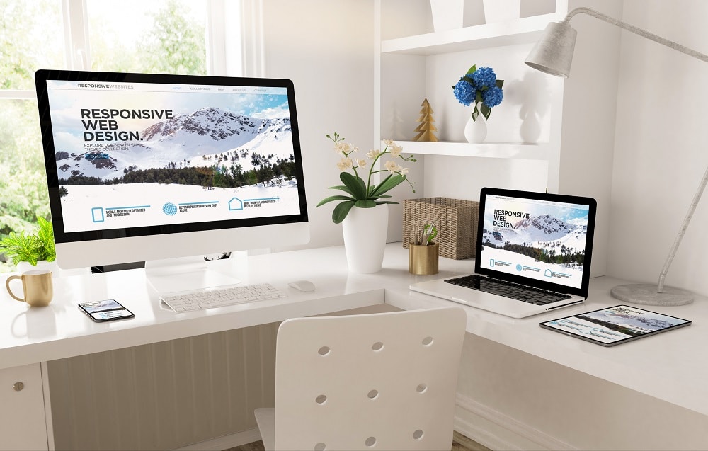
Here are some websites that nailed their web design.

Human Interaction

Human Interaction


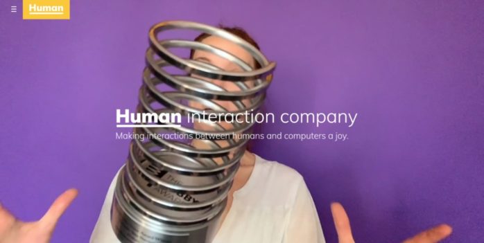
When your entire business is centred on how to make human-computer interaction great, you must get your website design right. Human Interaction lives up to the expectations with its striking yet streamlined web design.

The homepage banner above the fold contains just the name of the company and its tagline with no call to action. The banner with moving images effectively catches your attention without being too distracting and will encourage you to scroll down for more.

As you scroll through, you will see mainly grid-style layout highlighting what the company is all about (approach), some case studies (work), and blogs (stories). The complete list of the case studies and blogs can also be accessed through the hamburger menu under work and stories respectively.

The info contained in the grids are just snippets and clicking them will lead to another page where you will find the full information. This is a great way of providing vital info without cramming the homepage.

One look at the website and you’ll know what image they are going for. The use of not-so-serious, mostly human images, the colour palette, and the language and tone convey that they are an approachable tech company. The people behind the company are presented as relatable human beings. They’re named Human after all.

AHM

AHM - Website


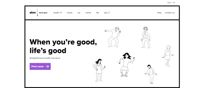
AHM brands itself as “straightforward insurance” and its website reflects its tagline.

These guys have taken a different approach to web design as they kept their colour palette neutral and limited its use of images to simple line drawings.

One of the advantages of this simple colour palette and illustration is speed. The site is nice and speedy even on mobile as it does not have to render too many images.

The homepage is very minimalist (as the rest of the pages). Not counting the website banner, only five items are featured on the homepage which are presented in a grid layout.

The rest of the info can be accessed through the standard horizontal menu on the desktop and the hamburger menu on mobile.

Also, every piece of their website design is reflected across their entire brand. From TV to printed media, this brand is really strong.

Tropical North Queensland

TNQ


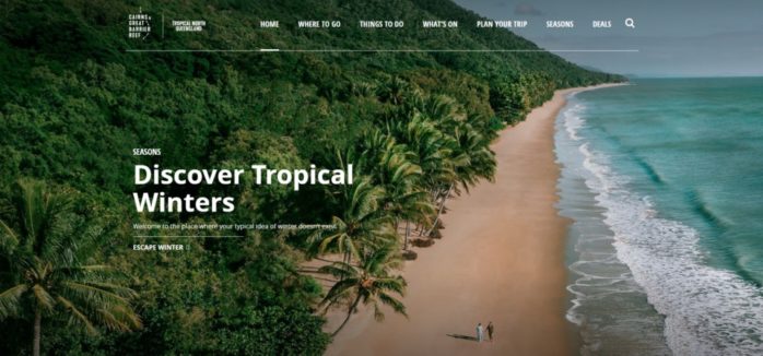
This simple and elegant website will make you want to go and explore North Queensland.

It effectively shows you so many beautiful places to explore and things to do without making the page look cluttered by using grids, manual image sliders, and a horizontal menu.

Despite featuring many images, the website still loads fast both on desktop and mobile.

Koox

koox-website


This minimalist website by Koox, a quick-service restaurant based in London, is elegantly designed.

There are only four options under the menu – home, food, about, and order, giving it a streamlined look and feel.

The website also gives you one bite-sized info at a time. Under the Food page, for instance, you will be presented with one item at a time as you scroll down the page. Clicking on the plus button will show the list of ingredients used.

The ample use of white space effectively brings focus to the pretty food pictures. This adds to the overall visual appeal of the website.

Mammut Expedition

Mammut Expedition


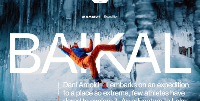
Outdoor gear company Mammut successfully showcased some of their products by featuring Swiss speed climber Dani Arnold’s expedition to Lake Baikal on this visually stunning website.

The homepage shows thrilling photos of Arnold as he explored the place, interspersed with the Mammut products he used and their features. You cannot buy any of these products directly on this website, but each product has a link that would bring you to Mammut’s online store.

The site is easy to navigate both on desktop and mobile. The visual effects work well on both desktop and mobile too.

Final word…

Mettro are a proudly Queensland, independently owned and operated digital agency that has been delivering award-winning website design & development and digital marketing for over 20 years. We are dedicated to solving our client’s business problems with smart, simple digital solutions and have the testimonials to prove it.

We’ve built thousands of digital solutions including apps, eCommerce websites, custom software, eLearning applications, WordPress websites and Shopify Websites.  Contact us or book a one-one-one to discuss your website design project!

Written by Raeleen  |  28 July 2021