The Evolution of Website Design Layout, and how to Decide which Layout is Best for your Website

Web design layouts are constantly evolving. Previously, websites were designed to be viewed mainly on a desktop or laptop. But now that we have all kinds of devices of varying sizes and mobile devices are becoming more dominant, web designers and developers have to be more creative and understand a lot of technical background when it comes to web design.

Types of Website Design Layout

To better understand the different website design layouts, here’s a quick introduction on Cascading Style Sheets (CSS).

CSS is used to design how the pages of your website will look. It styles the text (typeface, size, colour, and alignment), image size and alignment, bullet styles, and other visible elements of your website. The design layout is also created using CSS. It’s good to know about because it helps to understand how layouts are managed within a website.

With that out of the way, let’s dive into the different types of website design layouts.

Fixed Layout

Web sites with fixed layouts use a container or wrapper to hold all the elements on the page such as images, columns, fonts, etc. The width of the container is defined using fixed units (pixels) usually 960 (for earlier websites) or 1200 pixels for desktop browsers. Modern containers are bigger than ever with an increasing trend to wide websites on desktop browsers.

When the dimensions are set in pixels in the CSS, the container width will not change even if the browser is resized or a different device is used to view the website.

So if you have a huge monitor and the width of the webpage is designed for regular-sized screens, the web page will have big margins on both sides.

On the other hand, if you have a smaller screen size like in a small laptop or when you resize your browser, the screen will not display the whole width of the page and you will have to scroll horizontally to see the rest of the content.

The fixed layout was dominant in the early days of the internet when desktops ruled. Even then, the user experience is not the same for everybody because it depends on the screen you are using.

So when mobile usage started to rise, this disadvantage became even more apparent. Websites with this layout are harder to view on tablets and mobile phones. Texts appear smaller on a mobile device so it is necessary to pinch and expand to zoom in and read the content.
The solution for this issue was to create at least two versions of the website. One is designed for desktop viewing and the other is for mobile. The stand-alone mobile version is more content-centric because of the limited space and uses bigger fonts to ensure readability.

When you visit a website using a mobile phone, you will be directed to the mobile version (m.website.com) instead of the desktop site (website.com).

But having two or more versions of a website also has its disadvantages. For one, having separate URLs can affect the website’s SEO negatively. Also, if you have to change something on your website, you have to do it across multiple versions of the site.

Also, a lot of smartphones and tablets are coming out in different sizes and it is becoming hard to keep designing versions that will work for many devices and browsers.

Because of this, the fixed design layout has gone out of favour. It is hard to find a website that uses this type of layout design nowadays.

Liquid Design Layout

In liquid design layout, when you resize the browser or use a different device, the page will always fill out the width of the viewport

This is achieved by using flexible units (percentages) instead of fixed units (pixels) in the CSS.

One disadvantage of liquid design layout is that it is hard to control how the site will look when viewed from different devices.

If you view the website from a very large screen or smart TV, the content gets stretched out and it can look unappealing. When viewed from small devices or viewport, the content can get smooshed together and might affect readability.

Liquid CSS

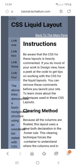
This is an example of a webpage that uses a liquid design layout. 

Adaptive Design Layout

In adaptive layout, the web developer creates multiple fixed design layout sizes. It is a common practice to develop six designs for the six most common screen widths namely 320, 480, 760, 1200 and 1600 pixels.

The website detects the type of device then selects and displays the layout that is most suitable for the screen.

However, when using a desktop or laptop computer, resizing the browser will not affect the design since the adaptive design layout is built using a fixed layout. So if you resize the browser and reach a certain point, you will have to scroll horizontally to see the rest of the width of the page.

One advantage of using adaptive design over the fixed layout and stand-alone mobile design combination is that this can be done using a single URL.

Adaptive websites also generally load much faster because the device only receives data necessary for best performance. For example, a low-end smartphone will not receive the same high-resolution imagery as a mid to high-end smartphone.

But like having separate mobile and desktop sites, adaptive design is a time-consuming process since you have to design for multiple devices. It is also harder to maintain because if you need to change something on your website, you have to do it across multiple layouts.

Amazon, Alibaba, and USA Today use the adaptive design layout.

Responsive Design Layout

In contrast to adaptive design layout, responsive design uses only one layout but the content, navigation, images, and other elements on the page are reconfigured to fit the user’s screen.

The responsive design layout is built on a fluid layout. This means that it also uses flexible units (percentages) rather than fixed pixels in the CSS.

But in addition to that, responsive design uses media queries to adjust the design pattern based on the defined breakpoints. In other words, if the width of the viewport reaches the set breakpoint, then a certain design pattern will be applied.

Responsive design accommodates all types of devices and orientation so it adds to a positive user experience regardless of the device being used.

Like the adaptive design and liquid design layout, you only need a single URL for a responsive layout. That means it is better for your SEO and it is also easier to monitor your analytics since you will only have one source of information.

A responsive design layout is also easier to maintain than an adaptive and a fixed layout since any changes on the website will only need to be made once.

Google also recommends responsive design because it works better for Google algorithms. Today if your website isn’t mobile friendly, Google will penalise you.

One disadvantage of a responsive layout is that if not done properly, it can take longer for the website to load on lower-end devices.

Because of the above-mentioned advantages, many websites today use a responsive design layout.

Web Design Agency Brisbane

Whether you want to build a brand new website or redesign an existing one, it is important to partner with a digital company that has expertise in website design layouts and has firm foundations in web design and development.

Mettro, a leading web design and development company in Brisbane, provides top-notch web design services for any type of business.

We are a proudly Queensland, independently owned and operated digital agency that has been delivering award-winning website design & development and digital marketing for over 20 years. We are dedicated to solving our client’s business problems with smart, simple digital solutions and have the testimonials to prove it.

We’ve built thousands of digital solutions including apps, eCommerce websites, custom software, eLearning applications, WordPress websites and Shopify Websites.

Contact us or book a one-on-one to discuss your website design project.

Written by Raeleen  |  30 September 2021