Nationwide Insurance
Nationwide Insurance is an insurance company based in the United States.
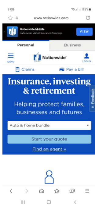
- The website’s design is streamlined.
- No pop-ups or interstitials. You are given the option to install their app, but the placement of the notice does not interfere with the website
- Two tabs on the top — personal or business allow you to identify the types of users to customise your experience.
- Common tasks are easily available. In this case, get a quote, pay a bill, file a claim, find an agent, and log in buttons can all be found above the fold of the website, whether you are accessing from a desktop or a mobile phone.
- Calls to action is front and centre
- An accessible home button allows you to return to the home page with one tap.
- Menu options are not overwhelming
Cornerstone Medical Recruitment
Cornerstone Medical Recruitment offers a personalised medical recruitment service. It aims to make the best match possible between employers and job seekers, not only in terms of skills to job position but also workplace culture, lifestyle and personal fulfilment opportunities.
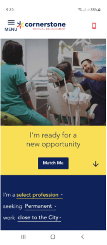
- There is a click-to-call button if users want to call directly from the site.
- An accessible home button allows users to return to the home page with just one tap.
- Call to action in front and centre of the website
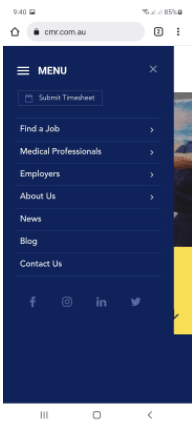
- Menu options are not overwhelming.
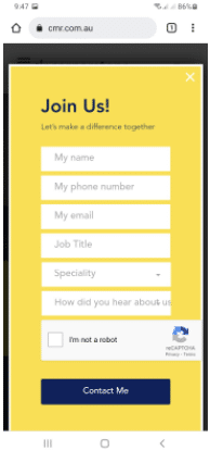
- Streamlined information entry with an autofill function to make input hassle-free.
Etsy
Etsy is a popular eCommerce platform where people can buy and sell vintage and handmade items.
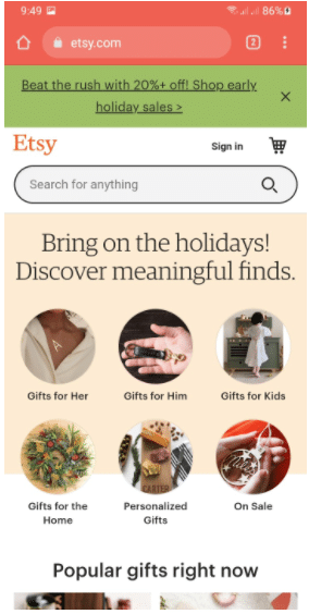
- Promotion placement does not interfere with the website.
- You have the option to sign in but you’re not required to create an account if you just want to explore the site.
- Navigation options for two types of users: the searchers (those who want to buy with a specific product in mind), and the browsers (those who just want to browse the site and look for something that might interest them).
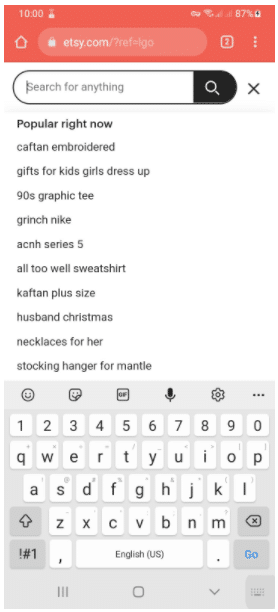
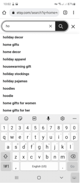
- Predictive search and popular searches lessen the hassle of typing in the complete queries.
Max Solutions
Max Solutions is a large corporate entity that provides a range of community services including employment, disability, and training services.
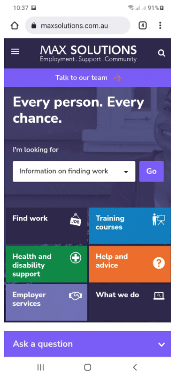
- There is an accessible search button on the home page
- Contact information is easy to access through the “talk to our team” button on the home page, on top and at the bottom (contact us button) if you scroll through the page.
- Everything you need is upfront, yet the website looks streamlined.
- Got a quick question? There is an ask a question button at the bottom of every page that leads you to a chat function.
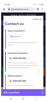
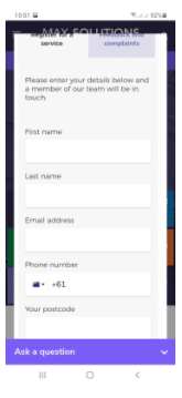
- The contact us page provides users with many options to connect: via chat (same as the ask a question button), phone, email, or a form, depending on the intent. Autofill is enabled on the site, so you don’t have to type in your info.
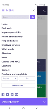
- Multiple access points for news, About Us, and more detailed info about the services. Users can scroll down the homepage or access them through the menu.