3 Design Mistakes You’re Probably Making on Your Website
By Raeleen
| 3 April 2020
A few small design tweaks can make a big difference
Design matters. We know that. Do it right and your customers will come back to your site again and again. But making these common mistakes could cost your business. Here are the three most common mistakes we’re seeing right now, and what you can do to avoid them.
- Not designing for where your audience is.
Don’t ignore the platforms your customers are on right now. Look at your stats to see where your audience is and what platforms and devices they’re using. You can’t get away with not having a responsive website now, so designing for mobile is a given.
But your stats might tell you that 80 per cent of your audience are on their mobiles, so you will need to put 80 per cent of your love into mobile design. It also pays to look at trends and be ahead of them. What is happening in your industry? For example, healthcare providers are seeing more people wanting to take charge of their medical records, and we’ll see that kind of engagement rise.
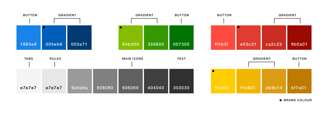
- Not setting up a colour palette from the beginning.
Don’t underestimate the power of the colour palette! When you’re looking at your user experience, there is a lot you can do to make your site come together, and using colour consistently across your site is one factor that your user may not overtly notice.
Still, the beautiful unity of colour will give a feeling of coherence and strong branding. And don’t fall into the trap of only establishing the colour palette of your brand. You will also need a secondary colour palette, including any colours you might use across the site. Otherwise, you could end up with 50 shades of grey when four would have sufficed. It also pays to check all of those colours across your devices because some colours will show up differently.
- Using big images.
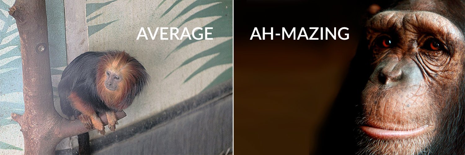
We love a big image – they’re excellent and they make a great impact. We’d go so far as to say big images make your site look awesome. So what’s the problem?
You’re going to run into trouble if your image isn’t AH-MAZING. Because a big average picture of a monkey is shouting at your audience, “Look at us, we’re average.” And another problem can be if your content doesn’t support those images and complement the entire site.
So what we’re saying is: start by considering the content that you have, the type of audience that will be reading it, the devices they’ll be accessing your site on, what you want your images to do, and whether you can keep up the big images in future updates. Then – and only then – by all means use big images. But make sure they’re awesome.

Want more? See our 6 great sites for design inspiration and Website Design without Coding