A rebrand for Queensland X-Ray meant developing a site that could work as their new brand evolved.
A new brand position for a market leader
The key to reaching the public and developing a relationship is to take on a more human face and to show you give the best customer service around. Queensland X-Ray was already offering brilliant customer service, so we just had to harness that and show it off.
Queensland X-Ray is a well established provider of medical imaging services across Queensland. They approached us to help them to find a new brand position, and to market themselves more directly to patients, rather than just to referring doctors, which had been their prior focus.
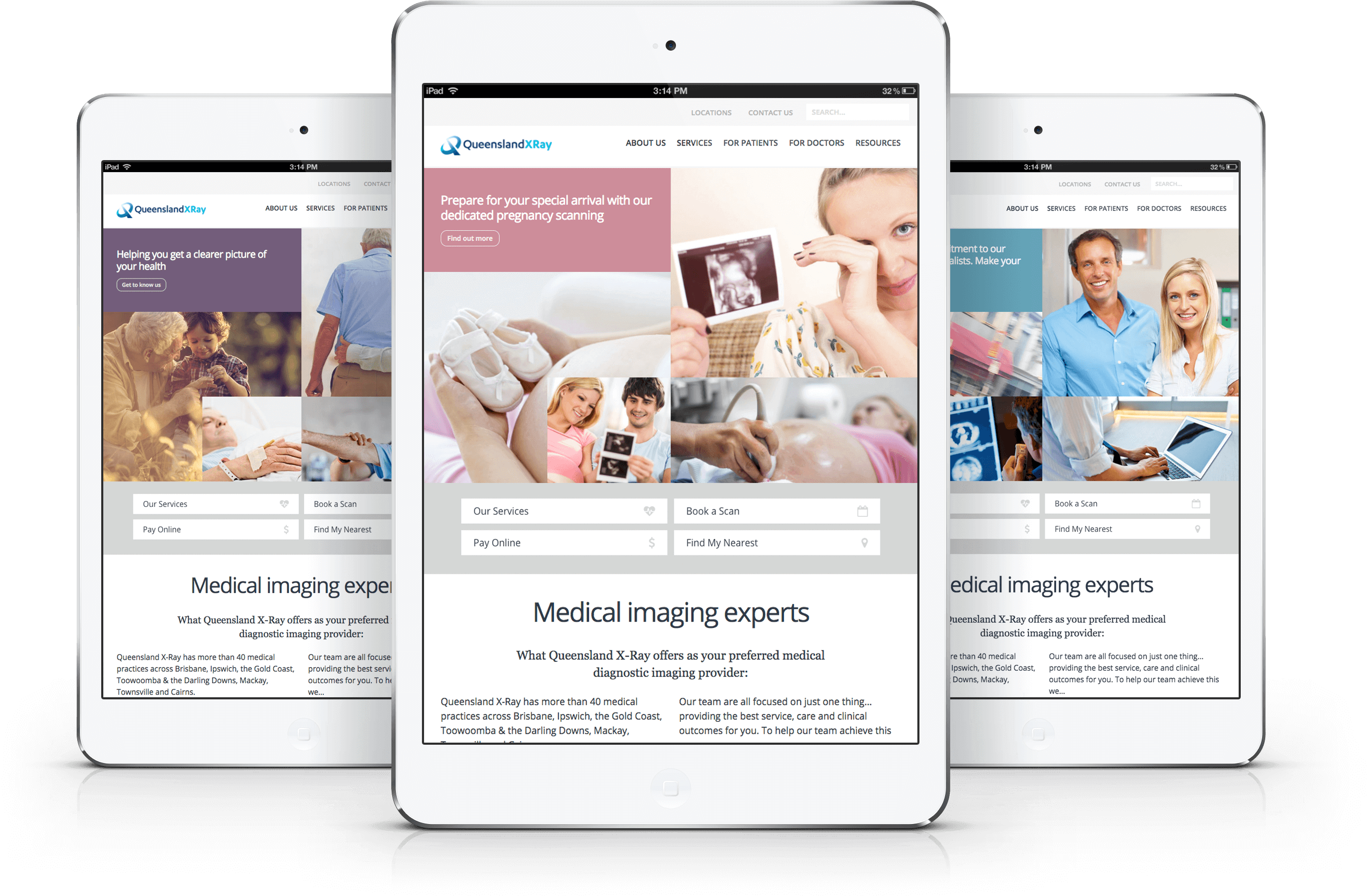
Say cheese
A big leap for the new website was to make use of stock images and images of their staff that told human stories, rather than highlighting the technical aspects and machinery. How many medical websites have we all seen with big machines? Plenty, and so uninspiring! Inspired by Humans of New York, we created the theme Humans of Queensland X-Ray, where we used faces to tell real stories of patients as they went through their care journey with Queensland X-Ray.
The elephant in the room
The big challenge we had, of course, was that when you go to Queensland X-Ray, you are generally not having a great day. You are most likely injured or ill, and usually going through an emotionally stressful time. So, while we can’t pretend that visiting Queensland X-Ray is going to be the best time you’ve ever had, what we can do is portray the idea that Queensland X-Ray will make your experience as positive as it can be – with professionalism, respect, comfort, care, modern amenities, and fast and accurate testing.
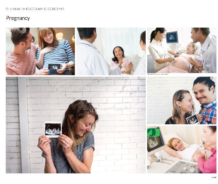
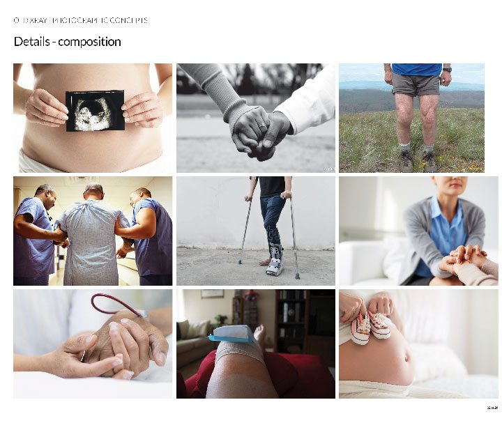
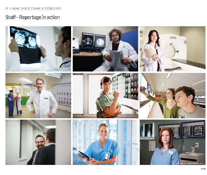
Full steam ahead
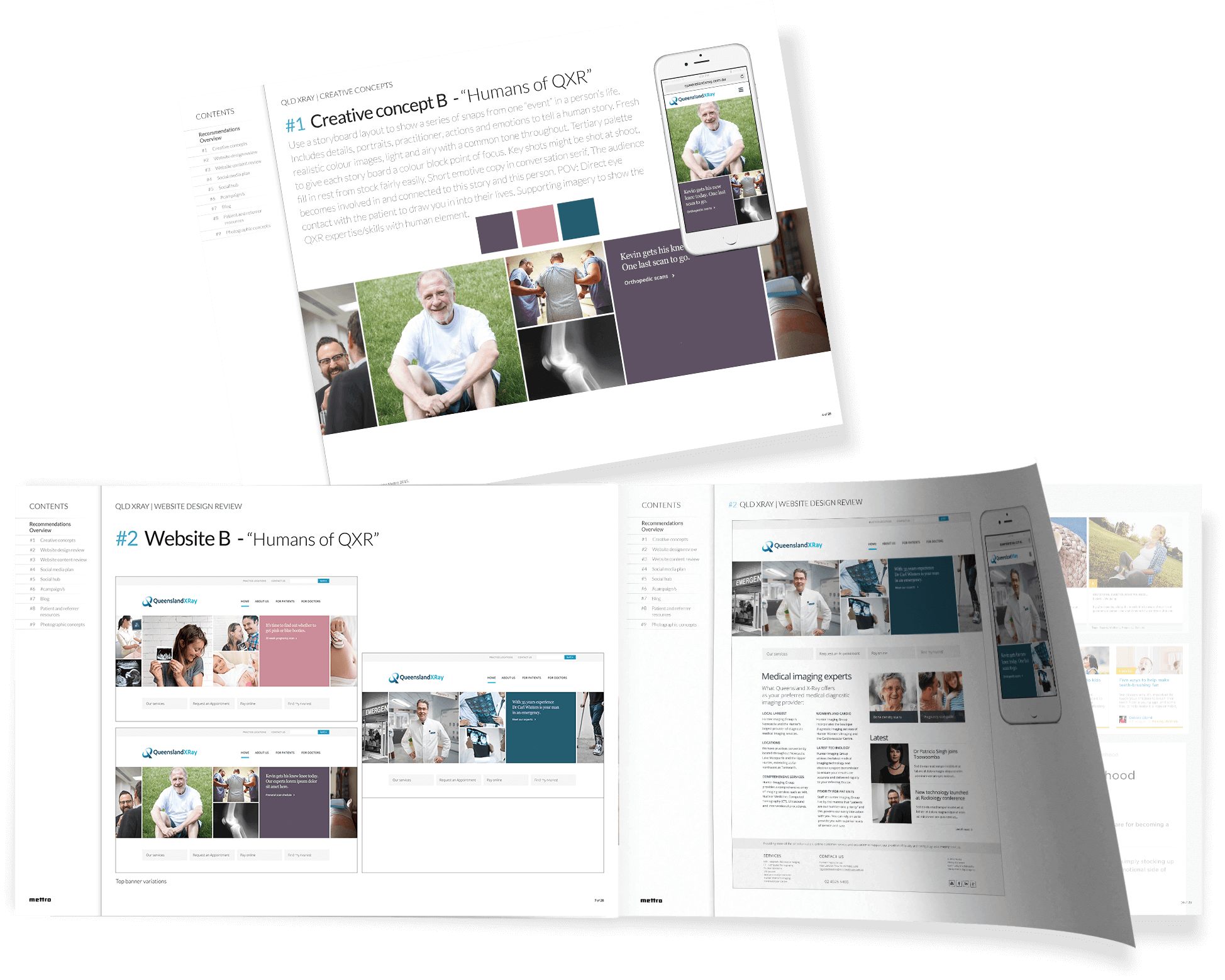
We presented our ideas to our client, who loved the entire concept. The entire new website concept was launched in October 2015. It is clean, crisp and fresh, with an overwhelming human element. We’ve used realistic colour images that are light and airy, with a common tone throughout.
We rewrote the copy for the entire site to make it concise but emotive, and we presented it in conversation serif. Image panels form a storyboard, showing people’s stories in a broad scope, because they are so much more than ‘just’ a patient.
We have also set the tone and style for the blog, which Queensland X-Ray staff will continue to write articles for.
We also built a modal popover for the website for capturing prospect information and database segmentation. This is tied into an automatic workflow, including thank-you and follow-up emails to drive users into a funnel for future conversion.
We worked closely with our client throughout the project and we give them an A+ for being generally just awesome!
That’s what she said
“Raeleen and her team are supportive, energetic, positive and always open to new ideas and (lucky for me!) always there to bounce ideas and concepts off… which we invariably turn into incredible, effective, amazing marketing tools or tactics. What I love most about Mettro (and I have found this to be unique amongst digital agencies) is they blend incredible and beautiful design and brand stories with serious coding/technical expertise that ALWAYS has the user and their experience at heart.”
Marnie Nichols
Marketing Manager, Queensland X-Ray
