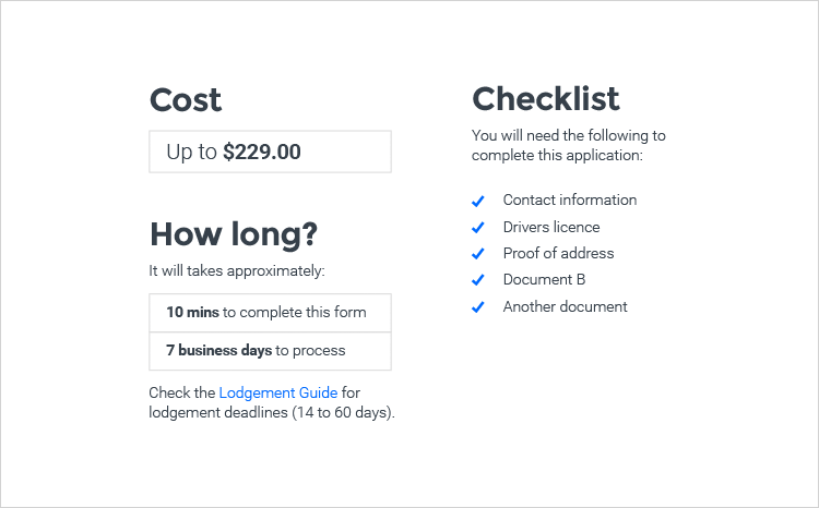
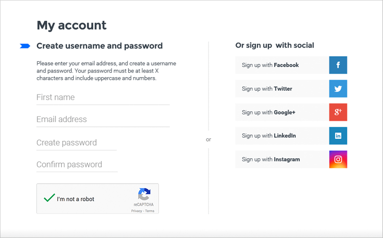
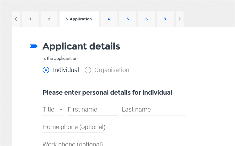
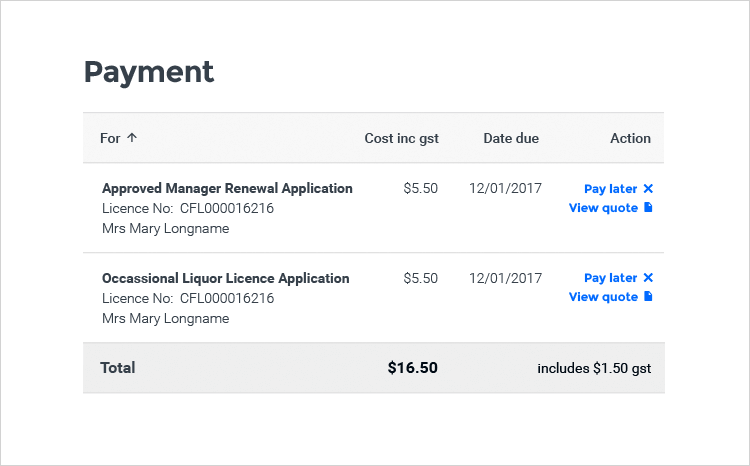
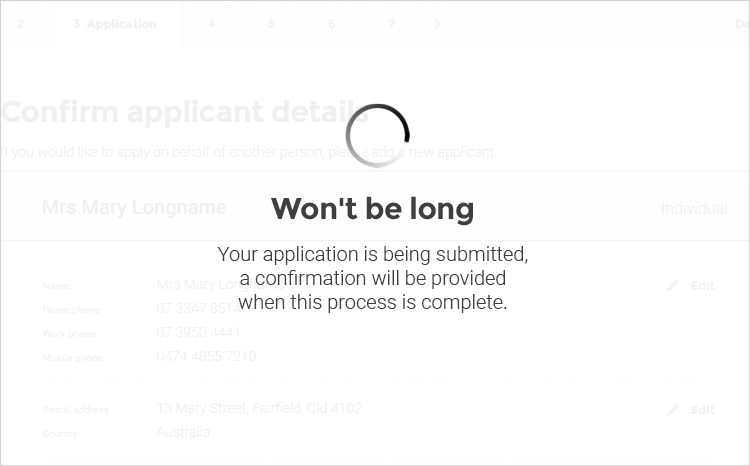
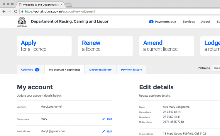
We created a modern, user-friendly licensing portal anyone can use.
Creating a universal licensing portal
We love a challenge at Mettro, and our client presented us with a doozy: create the user experience for a licensing portal that is easy to use for a massive range of people, from government, store owners and licensing agents to dog owners wanting to fill out a registration.
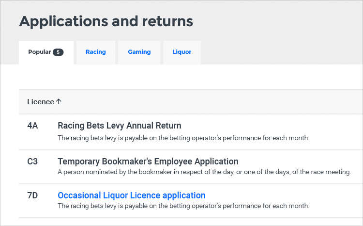
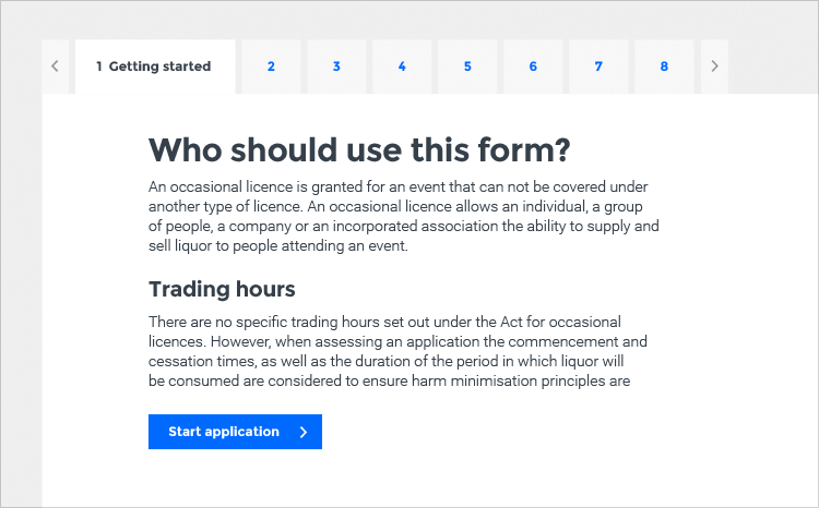
We created a modern user interface that has a comprehensive style guide and pattern library. The beauty of the portal is that it works across a disparate range of user personas – and we’ve given our client the ability to implement styles and patterns themselves across each of their clients, so they don’t need to keep coming back to us every time they want to create something new.
A truly iterative process
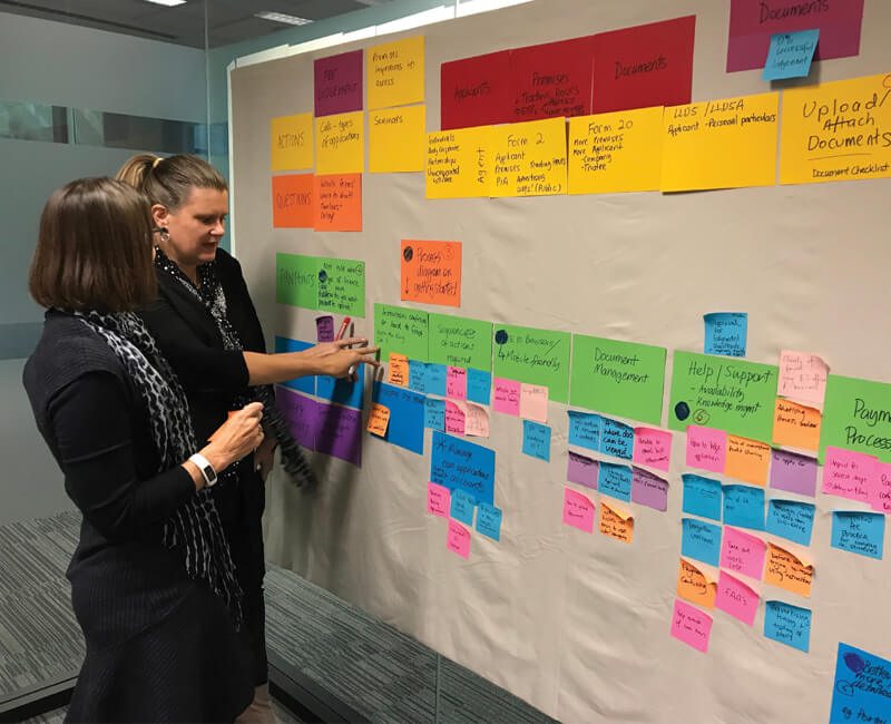
We knew this was a massive undertaking, but our experienced team was up to the task. We held a series of user experience and user interface workshops with stakeholders across a range of disciplines.
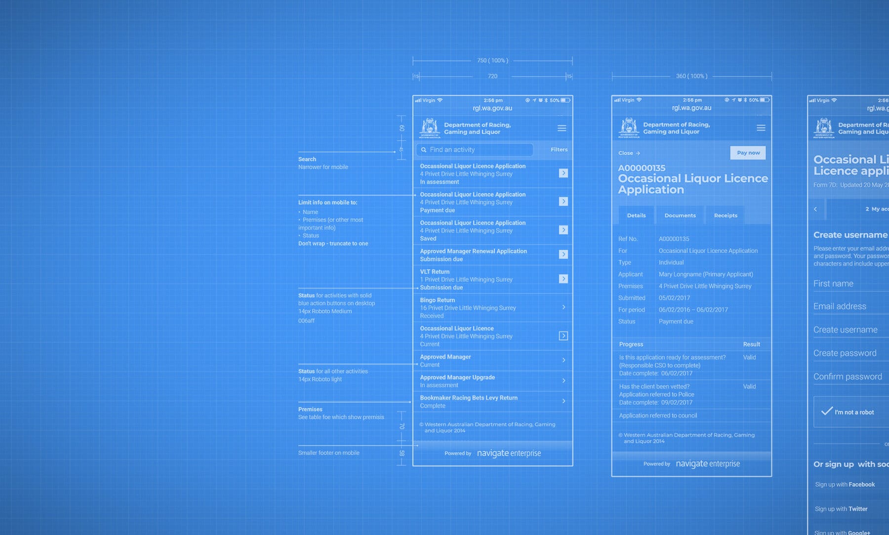
Then we used our design tools to create a rough prototype of our concepts to ensure we were working with our client as a team to build the best possible outcome for the project. Our iterative approach meant we took the time to understand the business every step of the way, and worked with our client to ensure we were hitting the mark.
We could have taken the easy way, offering our client exactly what they asked for, but we could see a better way.

We knew this was a massive undertaking, but our experienced team was up to the task.
Pump up the volume
The complexity and volume of the information we were working with was considerable, which is a challenge when you’re trying to create an agnostic portal that works across all industries, and to be used by just about any person. The key to our success was that continual stakeholder engagement – working together every step of the way.
Being brave
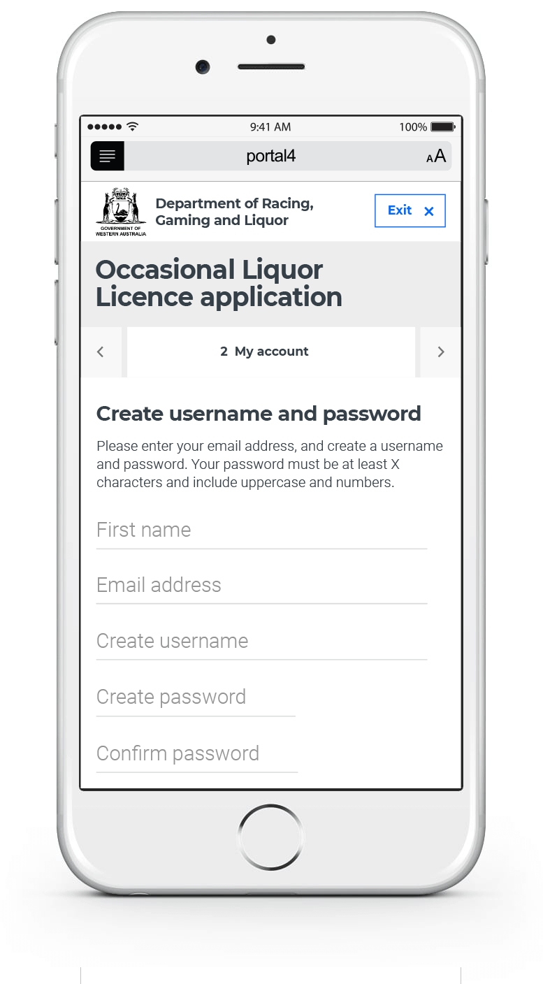
Part of our role is to help our clients to see the possibilities in their project, and this one was no exception. We could see that for this project to work most effectively it required features such as phone gestures, and collapsing and contextual menus – not as add-ons, but built into the product plan as integral functions. We explained this to our client and showed them the possibilities, helping them to be brave enough to make the leap with us.
A better way
We could see a better way that would revolutionise the way people apply for licenses across all industries, and we worked with Lighthouse in an iterative process to achieve great outcomes with them. We could have taken the easy way, offering our client exactly what they asked for, but we could see a better way. We made it our personal mission to give them the best advice and show them the possibilities. Once they could see what we saw, we were flying together.
