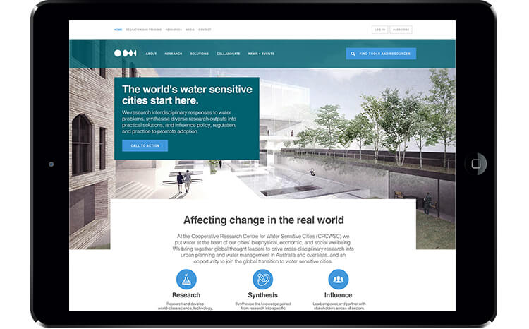
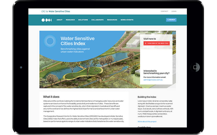
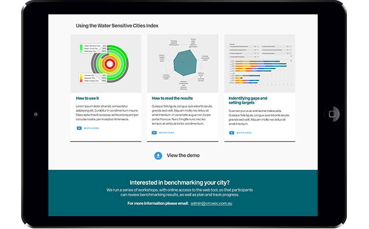
A complex user experience project to design and develop a smart, functional application and website to re-energise a global research authority.
The Cooperative Research Centre for Water Sensitive Cities (CRCWSC) is an innovative research organisation, bringing together global thought leaders to drive cross-disciplinary research. They have a key role to facilitate collaboration to help cities around the world to respond to today’s pressing water problems.
CRCWSC came to us with a brief to redevelop their website and enhance its capability to better support their diverse range of stakeholders. However we quickly realised this was a broader digital transformation project – to build a more progressive brand with thought-leader authority at a global level.

Establishing the project objectives
The first part of the project involved us working closely with our client to develop a strong focus from which we could hang all aspects of the project. We needed to not only engage, inform and empower multiple users and audiences and connect CRCWSC participants to build a strong community, but also facilitate the adoption of research.
We identified a new direction, underpinned by four key strategies:
- Find your voice – change focus of communication from internal to external
- Push out – be thought leaders, create meaning, show value
- Be useful – create dynamic, connected, easy-to-find, relevant content
- Build raving fans – a strong community to support and be ambassadors
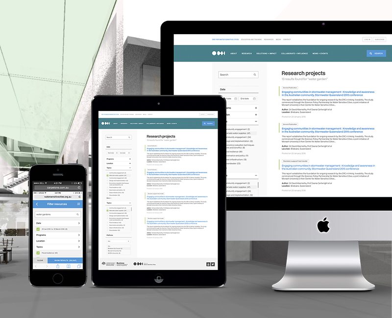
Usability issues identified through experience design workshops
We then went on to gather feedback from key stakeholders which we did via online surveys and through a series of experience design workshops, as well as website audits. The stakeholders told us that searching the vast amount of information on the current site was impossible and this clearly presented serious usability issues which needed to be resolved.
We determined that we needed to create multiple ways and angles that resources and content could be viewed by different stakeholders, plus we needed to put restrictions in place for content and users. We developed a series of user personas and a matrix of their content requirements which was matched against the content on the website.
We undertook desktop research to determine what competitors were doing. We developed a strategy document covering all aspects including the vision, concept and recommendations plus architecture and wireframes.
The website becomes an application
The next phase involved us undertaking interface design and honing the user experience. The website became more of an application as the content management became highly complex and taxonomies and structure were sharpened.
This project was a complex one because of the amount of information, the number of different and key stakeholders and the fact we were tasked with building a user-focussed website, intranet and extranet in one site.
Detailed taxonomies form the basis of this platform that houses thousands of academic articles. Built on a custom WordPress template, this is an example of excellence in technology, functionality and user-experience. Appified with levels of access and research materials go directly into the platform.
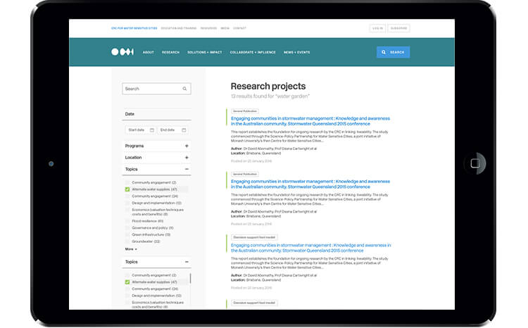
The content piece of the project involved reviewing thousands of content types and developing taxonomies and a highly structured approach to enable the user to easily find what they were looking for. The site pushes the boundaries of WordPress so that content can be easily found, followed and commented on.
Delivering excellence – the outcomes
- Architected taxonomy structure that allows for in depth, granular categorisation of thousands of content pieces. Categorisation was then used throughout the site to segments and create data views pertinent to specific user groups, increasing understanding among users.
- Creating new paths of discovery to content in the site targeting different users and stakeholders as their user stories are vastly different.
- Powerful multi-faceted search tool greatly improved time to find appropriate resources
- Deep integration with client’s CRM – automatic synchronisation and management of authors and contributors as well as their user accounts.
- Created tool to allow client to plot their research and outcome documents based on geographic location; Google maps, provided alternative way to visualise data, users can see the work going on in their local area.
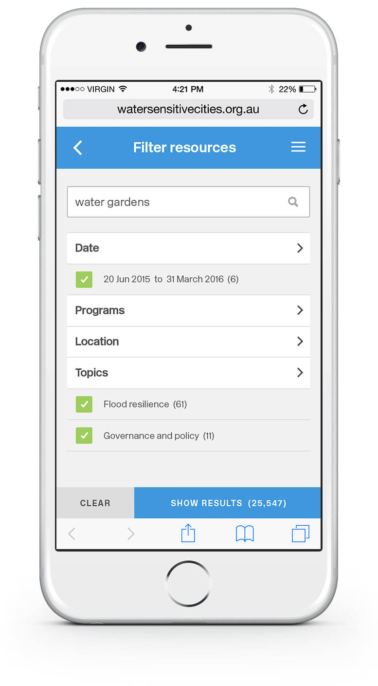
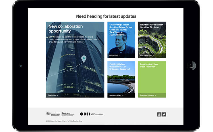
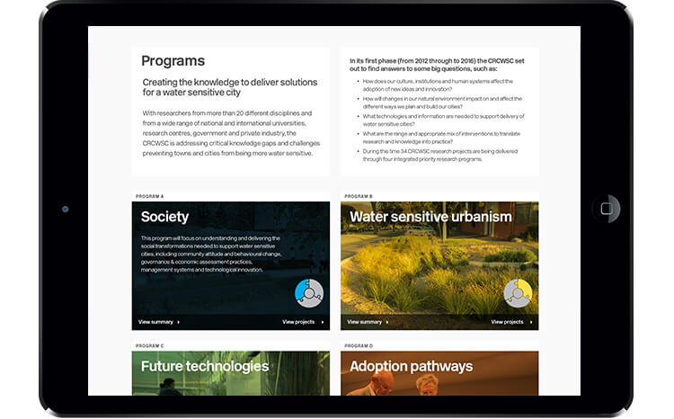
- Created an array of beautiful templates that met existing style guide requirements.
- Custom version tracking tool that allowed the client to notify interested parties when a content item was updated via email.
- Wrote custom plugin to route system notifications through MailChimp to record deliverability of emails.
- Constructed event system allows users to find events near them and buy tickets.
- Granular permissions for both administrative team and end users. Some content and tools are restricted to only partners or high level authors to the CRCWSC.
- Fully customised user dashboard provided a feed of updates and new resources that we’re pertinent to the individual’s interest and involvement with the CRCWSC.
- A subscription service was constructed to allow members to keep track of projects and areas that interested them.
That’s what she said
“We hit an important milestone today when I provided the CRCWSC Board with a demonstration of the new website. I think the round of applause, smiles and congratulations from all Board members confirms my own personal thoughts that we have created something pretty amazing. I wanted to take this opportunity to sincerely thank each of you for your efforts, contribution and going way beyond the call of duty. Your willingness to listen and persevere with creative solutions is really appreciated.”
Fiona Chandler
Executive Director – Communication and Adoption, Cooperative Research Centre for Water Sensitive Cities

