Website design layout is the structural part of visual design. Where things go on a page, how they relate to each other, and what the eye sees first. It’s the skeleton the colours, typography and copy hang off.
Get the layout right and the rest of the design has somewhere solid to live. Get it wrong and even beautiful work falls flat.
Layout is also the part of a website most people can feel but struggle to name. The page either makes sense at a glance or it doesn’t. Pulling that feeling apart, into the actual decisions behind it, makes layout much easier to brief, judge and improve.
What Website Design Layout Means
Website design layout is the arrangement of elements on a web page. It works by setting a structure (the grid), defining hierarchy (what matters most), and giving each element a sensible place to sit. Layout decides what the reader notices, in what order, and how easily they can find what they came for.
Layout sits inside visual design but isn’t the whole of it. Visual design covers everything you see on the page, including colour, typography, imagery and the overall look. Layout is the structural slice of that, dealing with arrangement and hierarchy. It also overlaps with user experience, which covers how people move through the site and what they’re trying to do. Layout is where the two disciplines meet.
A useful way to think about it. If your website were a house, visual design is the look and feel of the whole place, UX is the way people move from room to room, and layout is the floorplan. The floorplan is part of the look. It’s also the thing that decides whether the house works.
Why Website Design Layout Matters for Business
Layout is a business decision dressed up as a design one. The way a page is arranged affects whether visitors stay, whether they find what they need, and whether they take the action you want them to take.
A few specifics.
Layout decides what gets seen. Anything below the first screen has to earn the scroll. If the wrong thing is at the top, the right thing never gets read.
Layout drives scannability. Most readers don’t read websites top to bottom. They scan. Good layout makes the page legible at a glance. Bad layout forces people to work for the information, and most won’t.
Layout shapes trust. A page that feels organised feels professional. A cluttered page feels like a business that hasn’t got its act together, fair or not.
Layout affects conversion. The position, prominence and surrounding context of a call-to-action changes how often it gets clicked. The same button can perform very differently depending on where it sits and what’s around it.
None of this is new. It’s been true since the first commercial websites went live. What’s changed is the range of devices people now use, which makes good layout harder to pull off and more obvious when it fails. For a closer look at how this plays out in practice, our piece on why design matters goes deeper.
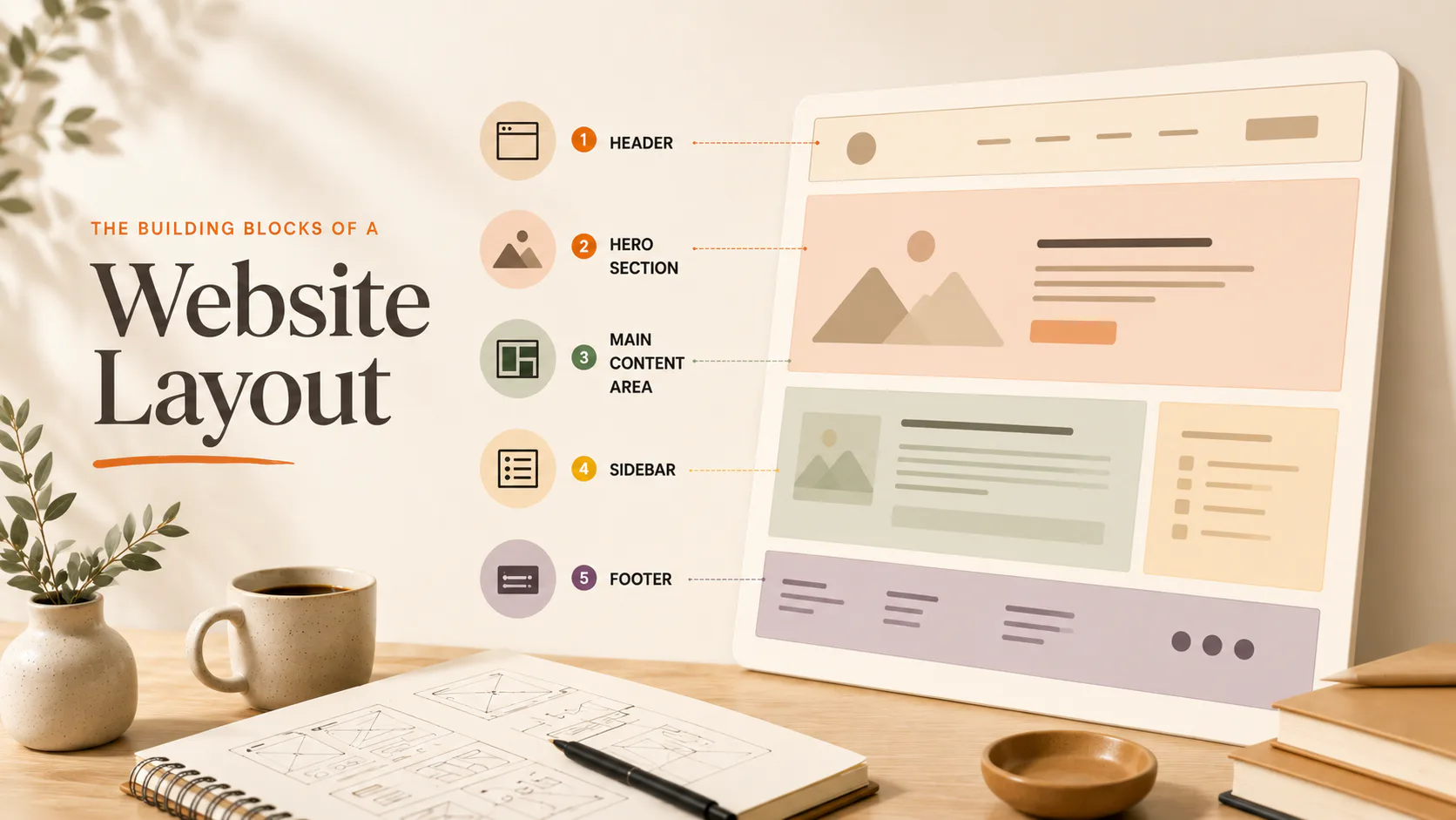
The Building Blocks of a Website Layout
Every web page is built from a handful of structural components. Recognising them makes it easier to think and talk about layout.
- Header. Sits at the top. Contains the logo, primary navigation, and often a search field or contact link. The header is the most consistent element across a site.
- Hero section. The first block of content below the header. Usually has a headline, supporting line, an image or video, and a primary call-to-action. The hero earns the rest of the page.
- Main content area. Where the substance of the page lives. The layout of this area changes depending on the page type. A homepage looks different to a blog post, which looks different to a product page.
- Sidebar. A secondary column running alongside the main content. Less common on modern sites, but still useful for blog posts and documentation.
- Footer. The bottom of every page containing the contact details, secondary navigation, social links, and legal information.
These pieces show up on almost every site. What differs is how they’re arranged, how prominent each is, and what fills them.
The Grid: The Hidden Structure Behind Every Page
Most well-designed websites sit on a grid. A grid is an invisible system of columns and rows that gives every element a logical place. You don’t see it on the finished site, but you feel its absence when it’s missing.
The standard web grid is 12 columns. Twelve divides cleanly into halves, thirds, quarters and sixths, which covers most layout needs. A full-width image takes 12 columns. A two-column layout splits as 6 and 6. Three columns of equal width take 4, 4 and 4. You get the idea.
The grid also flexes. On a desktop, three columns sit side by side. On a phone, the same three columns stack into a single column. The grid stays consistent, the layout adapts.
This is where responsive design lives. A well-built grid handles every screen size without breaking, which matters more every year.
Visual Hierarchy: What the Eye Sees First
Visual hierarchy is the order in which elements demand attention. It works by using size, colour, contrast, position and white space to signal what matters most.
Strong hierarchy is the difference between a page that communicates and a page that just sits there. Without it, every element competes equally for attention, which means nothing wins.
Most pages have three levels of hierarchy.
- Primary. The one thing the page is most trying to say or do. A headline, a hero image, a key call-to-action.
- Secondary. Supporting content that backs up the primary message. Subheadings, body copy, supporting visuals.
- Tertiary. Background information, secondary links, footer content, and fine print.
The eye should travel through these in order. If a tertiary element is shouting louder than the primary one, the hierarchy is broken, and the page is working against itself.
Common Website Layout Patterns
Some layouts come up so often they’ve become conventions. Conventions are useful because users already know how to read them. A few of the most common.
A single-column layout stacks everything in one vertical line. Simple, mobile-friendly, and good for content-heavy pages like long-form articles or landing pages with a single goal.
The F-pattern layout caters to how people scan text-heavy pages. The eye tracks across the top, drops down, scans across again, then runs down the left side. Best for blog posts and editorial content.
A Z-pattern layout suits pages with less text and a clear call-to-action. The eye moves top-left to top-right, diagonally down to bottom-left, then across to bottom-right. Good for landing pages and simple marketing pages.
Card layouts break content into rectangular blocks that work well across screen sizes. Each card is self-contained, which makes them easy to rearrange responsively. Useful for portfolios, product grids and dashboards.
A split-screen layout divides the page into two equal vertical halves. Helpful when you want to present two ideas side by side, or pair imagery with text without one dominating.
The magazine layout uses an asymmetric grid with images and text in varied sizes. Higher complexity, but the result feels editorial and considered when done well.
No layout is universally right. The right one is the one that fits the page’s job. For more on the structural principles behind a good site, why you should invest in a custom responsive website is worth a read.
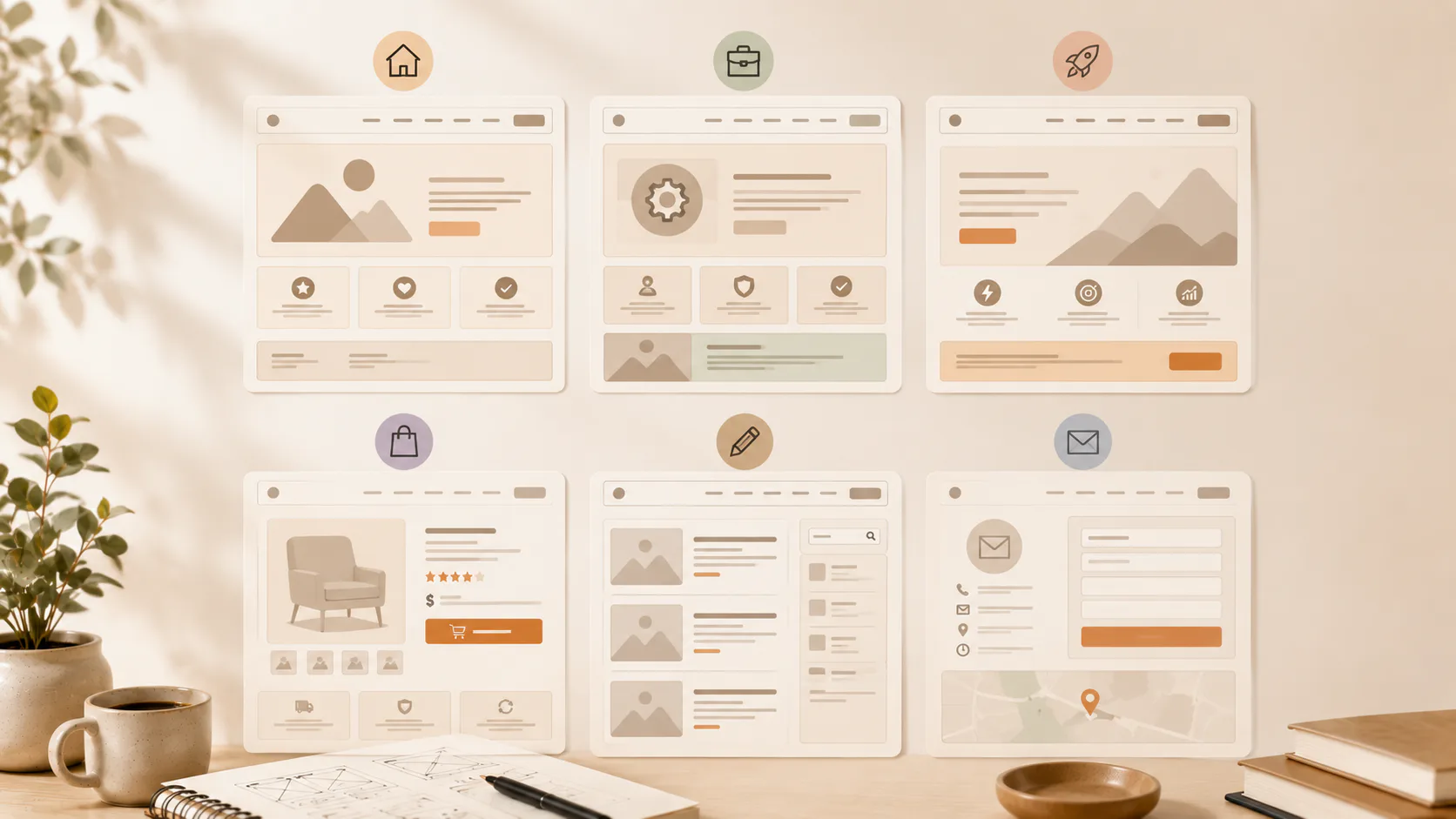
How Website Design Layout Differs Across Page Types
Different pages solve different problems. The layout should reflect that.
| Page type | Primary goal | Layout focus |
|---|---|---|
| Homepage | Orient the visitor, point them to the right next page | Clear hero, signposting to key sections, balanced content blocks |
| Service page | Explain a service and convert interest into enquiry | Hero with clear positioning, benefits, proof, single primary CTA |
| Landing page | Drive one specific action | Stripped-back layout, no navigation distractions, repeated CTA |
| Product page | Sell a specific item | Strong product imagery, clear pricing, options, add-to-cart prominence |
| Blog post | Inform or engage the reader | Reading-friendly column width, clear typography, related content |
| Contact page | Make it easy to get in touch | Multiple contact methods, low-friction form, location details |
Treating every page the same is a common mistake. The homepage layout that works as a front door fails as a checkout page. Pages built around their actual job perform better than pages built around a single template.
Why Does Website Design Layout Affect Conversions?
Layout affects conversions because it controls attention. People do what they notice. If the most important action on a page is hard to find or buried under three other competing elements, fewer people will take it.
A few specific layout decisions move the needle.
Where the primary call-to-action sits. Above the fold beats below the fold for most pages. Inside a visually distinct block beats floating loose in body copy.
How much friction sits between intent and action. Every extra click, scroll or form field costs you a percentage of users. A layout that puts the action close to the motivation outperforms a layout that makes people hunt.
Whether the page has a single focus or competes with itself. Landing pages with one clear goal convert better than pages trying to do five things. A layout that strips away distraction wins on conversion-critical pages.
The clarity of the visual path. If the eye can follow a logical sequence from headline to proof to action, the page works. If the path is unclear, people leave.
A small layout change can move a conversion rate by several percentage points. On a site doing meaningful traffic, that’s real money.
Mobile Layout: Not the Same Page in a Smaller Box
Mobile layout deserves its own thinking, not a copy of the desktop version squashed. The screen is smaller, the attention span is shorter, the input is touch instead of mouse, and the context is often “on the go” rather than “sitting at a desk”.
A few things change.
Single-column layouts dominate mobile. Multi-column desktop layouts have to stack, and the order of stacking matters. What sits second on a desktop should not always sit second on mobile.
Touch targets need to be larger than mouse targets. Buttons, links and form fields all need room around them so they can be tapped without misfires.
Long pages work on mobile. People scroll readily on phones. A taller, simpler page often beats a denser, cleverer one.
Page weight matters more. Heavy pages with too many images, scripts and effects punish mobile users more than desktop users. Layout choices that reduce page weight also improve performance.
Mobile-first design isn’t a trend. It’s the baseline. Building for mobile and adapting up almost always produces a better result than building for desktop and squeezing down. There’s more on this in Think Mobile First.
Common Website Layout Mistakes
The same handful of layout problems show up again and again on sites that aren’t quite working.
Cluttered heroes. Three competing headlines, two call-to-action buttons, and a stock image with text over it. Too much, all at once, all wanting attention.
Weak hierarchy. Everything the same size and weight, so nothing stands out. The eye doesn’t know where to go.
Hidden primary actions. The thing the page most wants the reader to do is buried at the bottom or styled like a footnote.
Inconsistent spacing. Some sections breathe, others are crammed. The page feels uneven, like it was built in pieces and never reviewed as a whole.
Mobile as an afterthought. Layouts that work on a 27-inch monitor and break at 375px. Tap targets too small. Content stacked in the wrong order.
Carousels and sliders. Most users never see slide 2. Whatever’s on slides 2 onwards is effectively invisible. If the content matters, put it on the page properly.
Most of these are fixable without rebuilding the site. A layout audit usually finds three or four small changes that meaningfully improve the page. Our piece on 10 design mistakes you’re probably making covers more ground if you want to go further.
A Last Word on Website Design Layout
Most layout problems aren’t about taste. They’re about clarity. A page either makes its job obvious or it doesn’t. Good layout makes the job obvious without the visitor having to think about it.
If your current site feels off and you can’t quite say why, layout is one of the first places worth looking. The fix often isn’t a redesign. It’s a closer look at what each page is for and whether the structure is doing that job.
Talk to us about your website.