Your Google ads are getting impressions. Maybe even clicks. But if those clicks aren’t turning into customers, the call to action (CTA) is the first thing to look at. To improve your CTA in Google Ads, write clear action verbs paired with a specific payoff, match the wording across your ad and landing page, and tailor the message to where the user is in the funnel. Get those right and you’ll usually see click-through rate, conversion rate and Quality Score move within a couple of weeks.
A weak CTA is one of the most common reasons paid budget gets burned without much to show for it, and it’s also one of the easiest things to fix. Sharper CTAs lift click-through rate, conversion rate and Quality Score, often within a couple of weeks of going live. The fixes below cover both ad copy and landing page buttons, and they apply whether you’re running a small local campaign or managing a six-figure monthly spend.
What Is a Call to Action in Google Ads?
A call to action (CTA) is the part of your ad or landing page that tells someone what to do next. It works by pairing an action verb with a clear payoff, so the reader knows exactly what happens when they click and what they get out of it.
In Google Ads, your CTA shows up across several places. Your headlines and descriptions. Your landing page button. The assets that sit underneath your ad (Google renamed extensions to assets a while back, but they do the same job). When all of those pull in the same direction, conversions follow. When they contradict each other, people bounce.
A simple example. The headline reads “Craving something delicious? Order now for fast delivery.” The description below it reads “Choose from hundreds of local restaurants. No minimum spend.” The button on the landing page says “Order Now.” The sitelink underneath offers “Browse local favourites” and a promotion asset shows “Get 15% off today only.” Every piece reinforces the same action.
A Quick Note on Quality Score
Quality Score is Google’s 1-10 rating of how relevant your ads, keywords and landing page are to the searcher. It works by combining three signals (expected click-through rate, ad relevance and landing page experience) into a single score that influences how often your ad shows and how much you pay per click. Higher scores mean cheaper clicks and better positions. Lower scores mean the opposite.
CTAs feed into all three signals. A clearer CTA lifts CTR. A CTA that matches the search intent improves ad relevance. A landing page button that delivers what the ad promised improves landing page experience. So while this post is about conversions, the same fixes quietly bring your cost per click down too.
Why Does CTA Matter So Much for Google Ads Performance?
Because the CTA is where intent becomes a conversion. A clear, specific CTA reduces hesitation, makes the value obvious and gives users a reason to act now rather than later. Vague CTAs do the opposite. They make the click feel risky, force the reader to guess what comes next, and quietly tank your conversion rate.
In our experience working on paid advertising campaigns for mid-size and enterprise clients, CTA fixes are often the fastest way to lift performance. You don’t need to rebuild your campaign structure or redo your keyword research. You just need to say the right thing at the right moment.
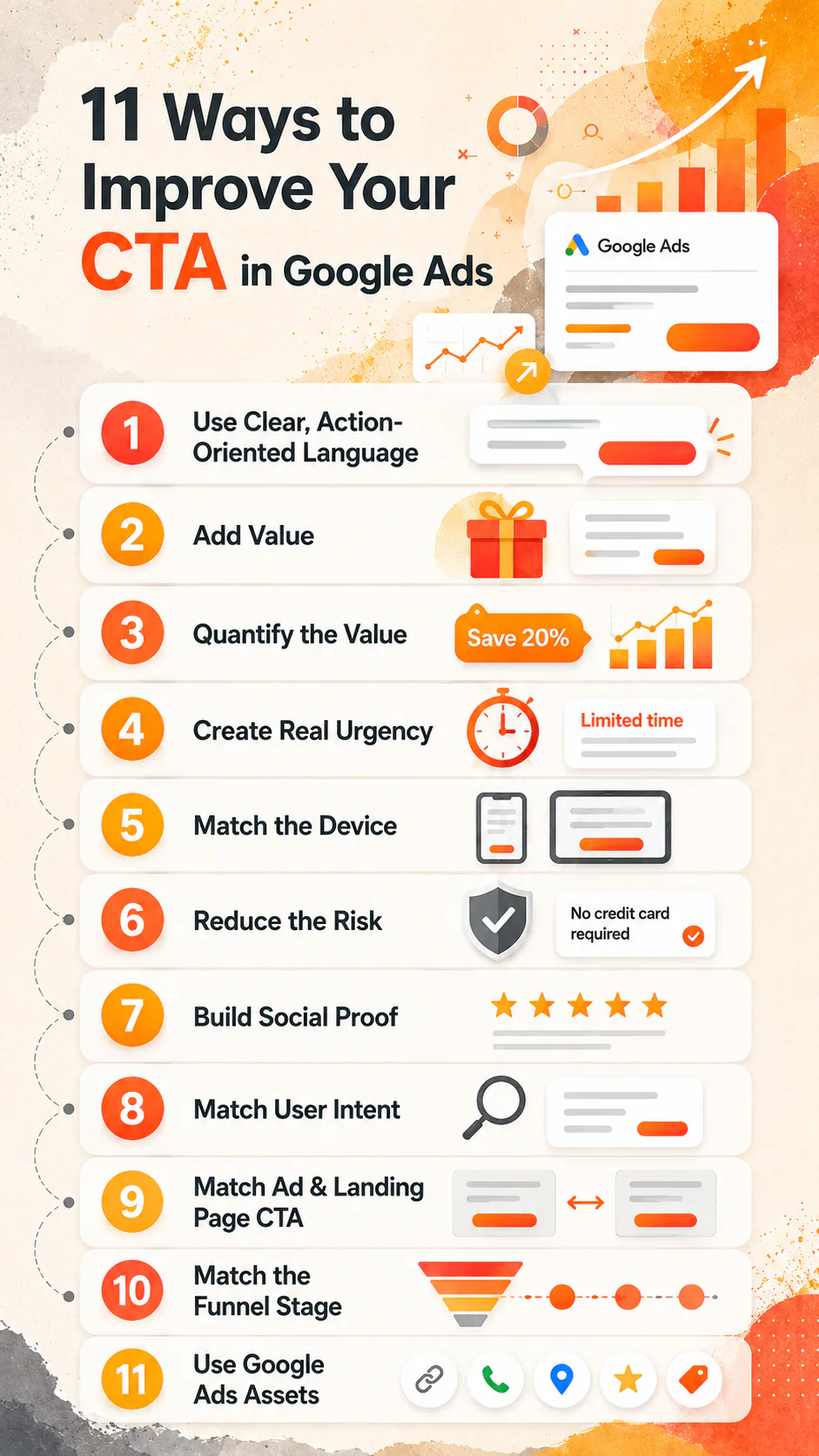
11 Ways to Improve Your CTA in Google Ads
The list below covers what works in ad copy, on landing pages, and across the ad assets that support both.
1. Use Clear, Action-Oriented Language
Start with a verb that tells people what they’re about to do. Get. Book. Download. Try. Call. Start. Order. Claim. Compare.
Then check your existing CTAs against that list. If yours starts with “Submit,” “Continue” or “Click Here,” you’ve got a problem. Those words don’t promise anything. They just describe a mouse movement.
2. Add Value, Don’t Just Demand Action
“Get a quote” is fine. “Get a free quote in 60 seconds” is better. The second one tells the reader what they’re getting and how long it takes.
A few examples of value-led CTAs that perform well.
- Get 20% off today
- Download the free guide
- Book a free consultation
- Get instant access
The pattern is simple. Action verb plus the payoff. If you can’t articulate the payoff in five or six words, the offer probably isn’t sharp enough yet.
3. Quantify the Value Where You Can
Numbers anchor trust. “Save 25% today” is more persuasive than “get a great deal” because the reader can do the maths in their head. Same with “Join 10,000+ customers” versus “join lots of happy customers.”
This applies to discounts, timeframes, customer counts and outcomes. If you’ve got a specific figure, use it. If you don’t, get one before you launch the campaign.
4. Create Urgency, but Only When It’s Real
Time pressure works. “Ends tonight,” “Only 3 spots left,” “Offer ends Sunday.” All of these can lift CTR significantly when the urgency is genuine.
When it’s fake, it’s a trust killer. Users have seen the same “limited time offer” running for six months. They notice. Use urgency where it’s true and skip it where it isn’t. There are plenty of other levers to pull.
5. Match the CTA to the Device
Mobile and desktop users behave differently. On mobile, lean into speed and convenience. Call Now. Get Directions. Order for Pickup. Tap to Quote.
These work because they map to what someone with a phone in their hand actually wants to do. A 10-word benefit-stacked CTA that fits nicely on a desktop landing page can feel like a wall of text on a 5-inch screen.
6. Reduce the Risk
If users are hesitating, the CTA should make the next step feel safer. “No-obligation quote.” “Try risk-free.” “Cancel anytime.” “No credit card required.”
You’re not making the offer easier. You’re just removing the reasons not to click. For high-consideration purchases (anything over a few hundred dollars, anything involving personal data, anything that locks the user in), risk reduction in the CTA can be the difference between a conversion and a bounce.
7. Build Social Proof Into the CTA Itself
Trust signals don’t have to live in a separate section. They can sit in the CTA. “Join 10,000+ happy customers.” “Rated 4.9 on Google.” “Trusted by 500 Australian businesses.”
This works best when the number is real, recent and specific. Round numbers feel made up. Specific ones feel measured.
8. Match the User’s Intent
The same product needs different CTAs depending on where the user is in their decision. Someone comparing options doesn’t want “Buy Now.” They want “See Plans” or “Compare Features.” Someone ready to commit doesn’t want a brochure. They want “Order Now” or “Buy Today.” Someone who needs help wants “Speak to an Expert,” not a self-serve checkout.
Get this wrong, and the user feels pushed. Get it right, and the CTA feels like the obvious next step.
9. Match the Ad CTA to the Landing Page CTA
This one is non-negotiable. If your ad says “Get a Free Quote,” the landing page should say “Get a Free Quote.” Not “Request More Info.” Not “Submit Your Details.”
When the wording matches, the user feels like they’ve arrived in the right place. When it doesn’t, they pause. Some of them recover. Most of them leave. We see this constantly when running conversion optimisation audits. The ad copy is sharp, the landing page is sharp, but the two don’t speak to each other, and conversions suffer.
10. Match the CTA to the Funnel Stage
Different funnel stages need different CTAs. The table below covers the four main ones.
| Funnel stage | CTA style | Example |
|---|---|---|
| Awareness | Soft, value-led | Download free guide |
| Consideration | Comparison or proof | See plans and pricing |
| Decision | Direct action | Buy now, 20% off |
| Post-purchase | Convenience | Reorder in 1 click |
If your ads target broad awareness keywords but your CTA reads like a checkout button, you’re asking too much too soon. Match the ask to the moment.
11. Use Google Ads Assets to Support Your CTA
Assets (formerly extensions) give you more real estate to back up the main CTA. The four worth focusing on.
Sitelinks sit beneath your ad and link to specific pages. Use them to give high-intent users a fast path to where they want to go. “See Pricing.” “Contact Us.” “Browse Menu.” “Compare Plans.”
Call assets add a phone number that mobile users can tap. For service businesses, this is often the highest-converting asset on the account. Set them to run during business hours so calls don’t go to voicemail.
Lead form assets let users submit their details directly from the ad without visiting your landing page. Useful for high-volume lead gen where speed matters more than the quality of the on-site experience.
Promotion assets highlight current sales, seasonal offers and discount codes. They’re a good way to add urgency without rewriting your headlines.
How to Improve Landing Page CTAs Visually
Words do most of the work, but how the CTA looks on the landing page matters too. A few rules that hold up across most templates.
Use a button colour that contrasts with the rest of the page. If your brand palette is blue and the page is mostly blue, the CTA needs to be a different colour. Contrast is what makes the button readable in a glance.
Make it large enough to tap easily on mobile. Apple’s guideline is 44 by 44 pixels minimum. We’d push that higher for primary CTAs, especially on long-form pages.
Give it space. A button crammed between paragraphs of text loses its weight. White space around the CTA tells the eye where to land.
Use one primary CTA per page. Secondary actions can sit nearby (a phone number, a “learn more” link), but if you have three competing buttons all shouting for attention, none of them wins.
CTA Examples by Goal
Different campaign goals need different CTA patterns. A short reference for the most common ones.
For selling a product, go direct. “Buy Now, 20% off.” “Order Today.” “Add to Cart.”
For promoting a service, lead with the action the user can take right now. “Call Now.” “Schedule a Visit.” “Book a Site Visit.”
For generating leads, anchor the value in time or convenience. “Book a Consultation.” “Get a Quote.” “Request a Callback.”
For offering a download, name the asset. “Get the Checklist.” “Download Free Guide.” “Send Me the Report.”
For starting a trial, lean on risk reduction. “Try It Risk-Free.” “Start Free Trial.” “Sign Up Today.”
CTA Examples by Industry
Industry context shifts what feels natural. A SaaS CTA that works in tech would feel jarring on a law firm site, and vice versa.
| Industry | CTA style | Example |
|---|---|---|
| eCommerce | Urgent, deal-focused | Shop Now, 20% off |
| SaaS / tech | Trial-based, low-risk | Start free trial, no credit card |
| Education | Informational, guided | Download course outline |
| Professional services | Personalised | Book a consultation |
| Health and medical | Reassuring, simple | Book your appointment |
CTA Mistakes That Quietly Cost You Conversions
The patterns we see most often when auditing underperforming accounts.
Vague language that doesn’t say anything. “Click here” and “Submit” don’t tell the user what they’re getting. Replace them with the specific action and the payoff.
Overpromising. If your CTA says “Free Trial” and the next page asks for a credit card, you’ve broken trust. The user clicks back, the bounce rate climbs, your Quality Score takes a hit, and your CPC goes up. One misleading CTA can hurt the entire account.
Ignoring user intent. Pushing for a sale when the user is still researching feels aggressive. Use softer CTAs for early-stage visitors and save the hard-sell language for decision-stage traffic.
Long, complicated CTAs. Three to seven words is the sweet spot. Anything longer slows the eye down and reduces the action rate.
Multiple primary CTAs on the same page. Pick one. Everything else is secondary.
CTAs that don’t match across the ad, the button and the headline. If they’re different, the user’s brain has to do extra work to connect the dots. Make them the same.
What Metrics Tell You Your CTA Is Working?
A CTA change should show up in the data within a couple of weeks of getting enough traffic. The metrics worth watching.
Click-through rate (CTR). A stronger CTA in your ad copy lifts CTR. Compare before and after with a meaningful sample size, not 50 clicks.
Conversion rate. This is the real test. CTR tells you the ad is working. Conversion rate tells you the CTA on the landing page is working too.
Cost per conversion (CPA). When CTAs improve, CPA usually drops because you’re getting more conversions from the same spend.
Bounce rate. If users click but leave the landing page within seconds, the CTA on the ad probably overpromised or the landing page CTA is unclear.
Form completion rate. Track how many people start a form versus how many finish it. A big gap means the CTA promised something easier than the form actually delivers.
How to A/B Test Your CTAs
A/B testing is how you stop guessing. Some basics that keep tests honest.
Change one variable at a time. If you change the CTA text and the button colour, you won’t know which one moved the needle. Pick one. Test it. Then test the next.
Use Google Ads experiments for ad copy tests, and a landing page tool (Unbounce, Instapage, Google Optimize’s successor or whatever your stack runs) for landing page tests.
Run the test long enough to hit statistical significance. Most tools will tell you when you have enough data. Stopping early is one of the fastest ways to ship a worse CTA based on noise.
Track conversion rate and CPA together, not just CTR. A CTA that lifts clicks but tanks conversions is a worse CTA, even if the CTR chart looks good.
Keep iterating. There’s no final winning CTA. Audiences change, offers change, competitors change. Treat CTA optimisation as ongoing work, not a one-time project.
Quick CTA Writing Checklist
Before you push an ad live, run through this.
- Is the CTA clear and specific?
- Does it include the value or payoff?
- Is there urgency or risk reduction where relevant?
- Does it match the user’s intent and funnel stage?
- Is it under seven words?
- Does the landing page button match the ad CTA?
If you can answer yes to all six, you’re in good shape.
Get Your Google Ads Working Harder
If your Google Ads are pulling clicks but not converting, the CTA is usually where to start. We help mid-size businesses, enterprise clients and government tighten their ad copy, fix the disconnect between ads and landing pages, and get more out of every dollar of paid spend across the wider digital marketing mix. If you’d like a fresh set of eyes on your account, talk to us about your Google Ads.