A favicon is the small icon that appears in a browser tab next to your page title, in your bookmarks, in your browser history and as the home screen icon when someone saves your site to a phone. It works by sitting in a special file on your website that browsers look for and display automatically. The name is short for “favourite icon”, since the original purpose was to mark bookmarked sites.
Your favicon is one of the smallest pieces of branding you’ll ever produce, and one of the few people interact with every day without noticing. It carries your brand into places your full logo can’t go. When someone has fifteen tabs open, the favicon is what helps them find yours.
Why Does a Favicon Matter for Your Brand?
A favicon matters because it carries your brand into the small, repeated moments where people scan, switch and return. Tabs, bookmarks, history results, mobile home screens. Each one is a tiny chance to be recognised, or to disappear into the default globe icon every site gets when it doesn’t bother.
There are three practical reasons it earns its place.
First, it helps people find you. With multiple tabs open, most people don’t read titles. They look for shapes and colours. A clear favicon is the difference between “where did that tab go” and a one-second return.
Second, it signals that the basics are done. A missing or generic favicon reads as unfinished. The opposite is also true. A clean favicon is a small signal that someone cared about the details, and visitors notice that whether they can name it or not.
Lastly, it extends your brand to mobile. When a customer saves your site to their phone, your favicon becomes the app icon they tap. That’s prime real estate. If yours is blurry, off-centre, or the WordPress default, it’s working against you every time they look at their home screen.
For more on how small details shape brand perception across a site, our piece on why design matters covers the broader principle.
What Makes a Good Favicon?
A good favicon is simple, square and readable at 16 pixels. That last part is the hardest. Most logos that look fine on a website fall apart at favicon size, because they were never designed for it.
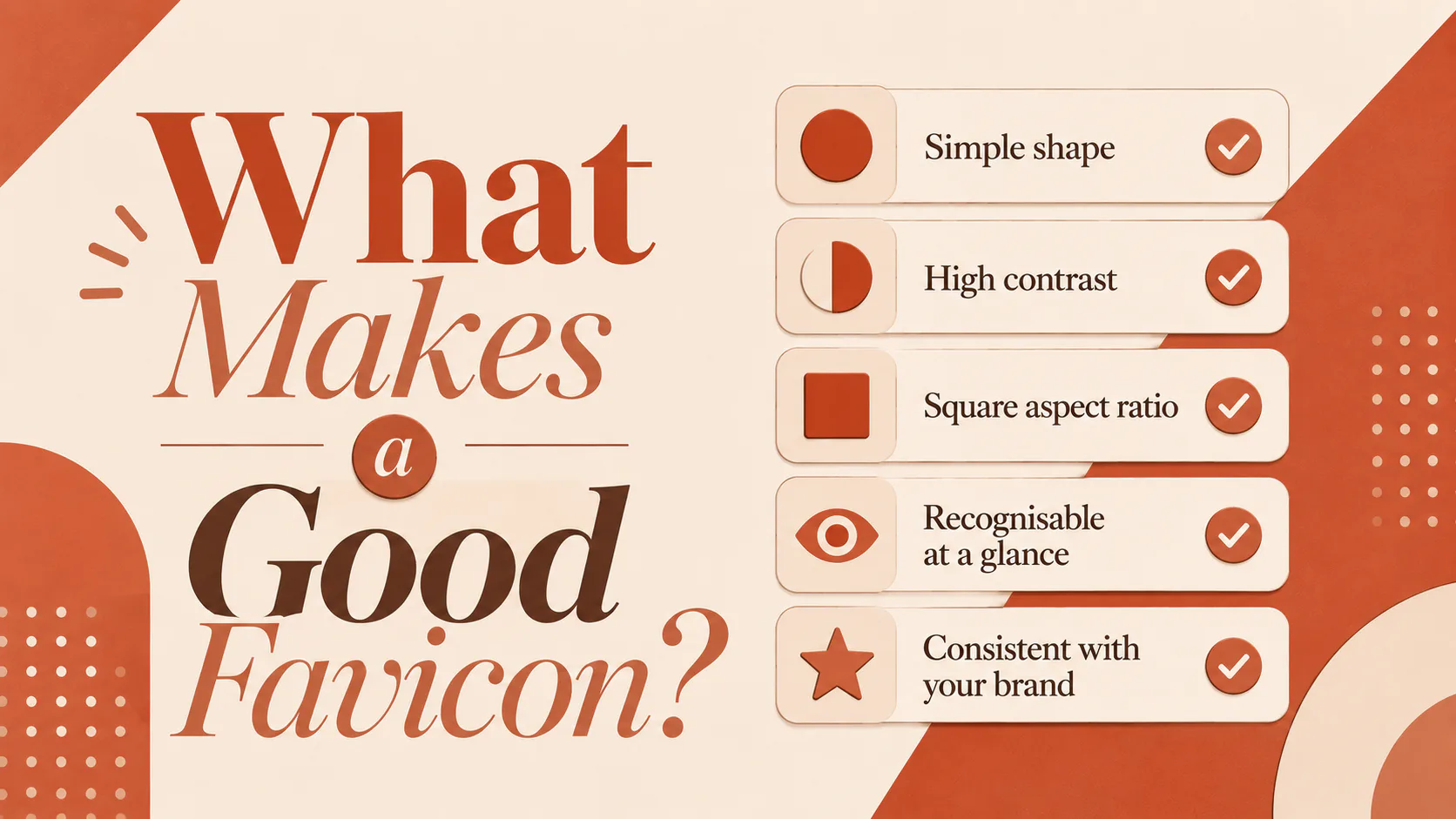
Five things separate a favicon that works from one that doesn’t.
- Simple shape. One symbol, mark or letter. Not a full logo with text. Wordmarks shrink to mush.
- High contrast. It needs to stand out against both light and dark browser themes. Mid-grey on white is invisible.
- Square aspect ratio. Favicons are rendered in a square. Anything else gets cropped or distorted.
- Recognisable at a glance. If someone has to squint, it’s not working.
- Consistent with your brand. Same colours, same feel. Not a different mark made just for the tab.
The original source file should be at least 512×512 pixels. That gives you headroom for every size a browser, phone, or operating system might ask for, from the 16-pixel tab icon to the 180-pixel iOS home screen icon. If your designer can deliver an SVG version as well, even better. We’ll come to why in a moment.
What Sizes and Formats Do You Need?
You need more than one. A modern favicon set covers desktop browsers, iOS, Android and Windows tiles, and increasingly, SVG and dark mode variants. Here’s what a complete set looks like in 2026.
| File | Purpose |
|---|---|
favicon.ico | Legacy fallback, bundles 16×16, 32×32 and 48×48 |
favicon.svg | Modern browsers, scales to any size, supports dark mode |
favicon-32x32.png | Standard browser tab icon |
favicon-192x192.png | Android home screen |
apple-touch-icon.png (180×180) | iOS home screen and bookmarks |
site.webmanifest | Tells browsers and PWAs which icons to use where |
You don’t need to create each of these by hand. A favicon generator does it from one source image, which we’ll cover next.
A note on SVG favicons. They’re now widely supported and have two big advantages. They stay sharp at any size, and they can adapt to a user’s light or dark mode through a CSS media query inside the file. The trade-off is that older browsers don’t support them, which is why most setups include both an SVG and a PNG fallback.
How to Make a Favicon
You make a favicon by taking a high-quality source image and running it through a favicon generator that outputs every size and format you need. Doing it by hand is possible, but rarely worth it, because the formatting requirements have grown over the years, and a good generator handles them all in one pass.
The starting point is the source image. Aim for a square PNG or SVG at 512×512 pixels or larger. If it’s a PNG and your icon needs a transparent background, save it with transparency. Avoid JPGs for anything with hard edges or solid colour fields, since the compression introduces fuzz around the edges.
From there, the steps are straightforward.
- Take your source image and check it works at 16×16. Open it on your screen, shrink it down and see if you can still tell what it is. If not, simplify before you generate.
- Upload it to a favicon generator (three good options below).
- Adjust the settings for iOS, Android and theme colour if the generator asks.
- Download the zip file the generator produces.
- Upload the files to your site and add the HTML it gives you, or install the WordPress plugin version if you’re on WordPress.
Three Favicon Generators Worth Using
There are dozens of favicon generators online. These three cover most needs, from “I just want it done” to “I want full control”.
RealFaviconGenerator is the most thorough option. You upload one image, preview how it’ll look in every browser and device, and download a complete package with the HTML to paste into your site. It also has a free WordPress plugin that handles the installation for you. It’s the closest thing to a default choice for anyone who wants the job done properly.
Favicon.io is faster and simpler. You can generate favicons from an image, from plain text or from an emoji, which is useful for quick projects or placeholder icons. The output is less exhaustive than RealFaviconGenerator but covers the main bases.
Favicon Generator.cc is the pixel-editor option, where you draw your favicon by hand at 16×16. It’s a niche tool, but useful if you want something genuinely original at the smallest size rather than a shrunk-down logo.
All three are free. Whichever you pick, give the same source image a careful look before you upload, because no generator can save a favicon from a poorly chosen source.
How to Add a Favicon to WordPress
If your site is built on WordPress, you have two quick options and one more thorough one.
The simplest method works on WordPress 6.5 and later. Go to Settings → General, scroll down to Site Icon, click Choose a Site Icon and upload a square image of at least 512×512 pixels. WordPress generates the main sizes automatically and adds the required HTML to your site. Save changes and check the result in an incognito window, since your browser will often cache the old icon for a while.
The Customizer method is similar and works on older themes. Go to Appearance → Customize → Site Identity → Site Icon and upload the same kind of image.
For full control, install the Favicon by RealFaviconGenerator plugin, run your source image through the RealFaviconGenerator settings inside the plugin, and let it handle every format and size. This is the option to choose if you care about how your icon looks on iOS home screens, Android, Windows tiles and PWA installs, rather than just browser tabs.
If you’re new to WordPress in general, our explainer on why we choose WordPress covers the broader picture of working with the platform.
Why Does Website Speed Affect Favicon Setup?
Website speed affects favicon setup because every page on your site requests the favicon files, and a poorly set up favicon can trigger 404 errors that show up in logs and slow first paint. The fix is small but worth doing.
Two things matter.
The favicon files should sit at the path the browser expects. For the base .ico, that’s the root of your domain, at /favicon.ico. For the others, the <link> tags in your HTML head tell the browser where to find them. Generators give you both the files and the HTML in one go, which is part of why they save time.
The files should be reasonably small. A typical favicon set adds up to less than 50KB total. If yours is bigger, the source images have been exported at too high a quality. Re-run them through the generator and check.
When Should You Update Your Favicon?
You should update your favicon whenever you update your logo, refresh your brand, change colours, or notice your current one looking blurry on modern displays. It’s a small change that often gets forgotten in a rebrand, and a mismatched favicon undermines an otherwise clean new look.
Also worth a refresh if your current favicon predates the Retina screen era and is still a 16×16 ICO file. Modern browsers and high-density displays will upscale it badly. Anything older than five years is probably due.
Keep Your Brand Sharp Everywhere
A favicon is a small detail with an outsized effect on how your site is perceived. If yours is the WordPress default, blurry, or doesn’t match your current brand, it’s a quick fix with a lasting payoff. Pick a clean source image, run it through a generator, install it properly and move on.
If you’d like a hand getting your site’s branding consistent across every touchpoint, including the ones most people forget, talk to us about your website.