Most websites don’t fail because of one big disaster. They lose ground through small, common web design mistakes that quietly cost trust, attention and conversions. The kind of stuff that doesn’t show up in a meeting agenda, but shows up in your analytics.
Three mistakes come up over and over. They’re familiar, avoidable, and still turn up on sites built by people who should have caught them. Each one is fixable without rebuilding from scratch.
Here’s what they are, why they cost you, and what to do about them.
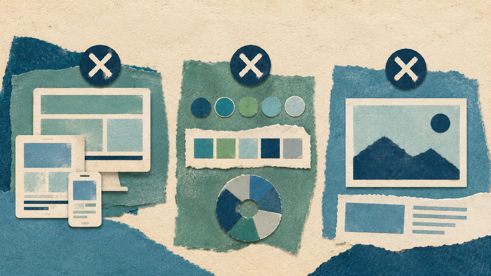
Mistake 1: Designing for the Wrong Audience on the Wrong Device
The first mistake is designing the site you’d like to look at, rather than the site your audience actually uses.
Open your analytics. Look at the device split, browser preferences and the screen sizes coming through. If your audience is 70% mobile and your design decisions assumed desktop, the most important version of your site is the one that’s getting the least care.
This is a different problem from “Is the site responsive?” Responsive is table stakes now. The real question is which experience you’re optimising for. A mobile-optimised site isn’t a desktop site that shrinks. It’s a site where the mobile experience is treated as the lead, with content priority, tap targets, image weight and loading speed designed accordingly.
What this mistake looks like in practice
You can spot it without much digging. The signs are usually:
- A homepage that looks polished on desktop and crowded on a phone
- Navigation that requires precise tapping or hides key actions behind menus
- Hero images that take up the entire first screen on mobile, pushing the actual content below the fold
- Forms with fields too close together to fill in without zooming
- Buttons that sit awkwardly close to the edge of the viewport
Each one of these costs you. Not always in a way you can see directly. Sometimes it shows up as a higher bounce rate on mobile or as a lower conversion rate from paid traffic, since most paid clicks come from phones. Other times as a slow, steady drift in rankings.
How to fix it
Start with the data. Pull a 90-day report and look at device, screen size and the pages where mobile users drop off. Then audit those pages on an actual phone, not a desktop browser at a narrow width. The two experiences are not the same.
From there, the work is prioritisation. Fix the pages with the highest mobile traffic first. Tighten the hero. Shorten the copy above the fold. Make sure the most important call to action is visible without scrolling. Get image weight down so the page loads on a 4G connection without making people wait.
It also pays to look at where your industry is heading, not just where it is. If your customers are moving toward self-service, app-style interactions, or quick mobile decisions, the design needs to keep up. The businesses that get this right tend to revisit their analytics every quarter, not every redesign.
For a deeper look at how to think about device strategy and audience, our website design and user experience design work both cover this in more depth.
Mistake 2: Skipping the Colour System
The second mistake is treating colour as a finishing touch rather than a system.
Most brands have a logo, a primary colour and maybe a secondary. That’s a starting point, not a design system. When the brief gets handed to a designer, or worse, to whoever’s editing the site that week, the gaps in the system get filled with guesses. Three years later, you’ve got five greys, two blues that are almost the same, four shades of accent green and a button colour that nobody can quite remember.
The result is a site that feels off without anyone being able to say why. Branding gets weaker. Hierarchy gets muddier. Accessibility gets harder to hold.
What a proper colour system covers
A colour system is a defined palette and the rules for how each colour gets used. It works by removing the guesswork from every future design decision. A solid system covers:
- Primary brand colours, with hex, RGB and accessibility ratings
- Secondary palette for supporting elements
- Neutral palette covering greys, off-whites and text colours
- Functional colours for success, warning, error and information states
- Hover, active and disabled states for each interactive colour
- Background variations for different content blocks
That sounds like a lot, but it’s not. A good system fits on two pages and saves hundreds of small decisions over the life of the site.
When you have an established colour system, whoever’s adding a new page or banner picks from a set palette instead of guessing. That keeps the site on-brand long after the designer’s handed it over, and makes ongoing content management a lot less painful.
How to fix it
If your site is already live, start by auditing what’s actually being used. Crawl the CSS, list every colour value in the codebase, and group them. You’ll usually find that a third of them are accidents. Pick the ones worth keeping, retire the rest, and document the result.
Then check contrast. Every text and background pair should meet WCAG AA at a minimum. According to the W3C’s WCAG 2.1 standard, body text needs a contrast ratio of at least 4.5:1 against its background. Tools like WebAIM’s contrast checker make this a five-minute job per page.
Finally, check across devices. Colour calibration varies between phones, monitors and tablets. A grey that looks crisp on a designer’s calibrated screen can look washed out on a five-year-old Android. Test on real devices, not just simulators.
Mistake 3: Leaning on Big Images Without the Substance to Match
The third mistake is using big imagery as a substitute for clear thinking.
Large, full-bleed images can be powerful. They can also be the laziest design decision on a website, because they look like effort without requiring much of it. The problem isn’t the size of the image. It’s what gets hidden behind that decision.
A big image makes a promise. It tells the visitor, “This matters, look at it.” If the image is genuinely strong, the promise gets kept. If it’s a generic stock photo of a handshake or a laptop on a wooden desk, the promise gets broken before the visitor has scrolled.
Why average images cost more than no images
There’s a quieter cost, too. Large images are heavy. They slow page load, hurt Core Web Vitals scores, and on mobile, they push the content the visitor actually came for further down the page. Google’s research on mobile page speed in 2017 showed that the probability of a bounce increases 32% as page load time goes from one to three seconds. A 4MB hero image is rarely worth that trade.
It also pays to ask what the image is doing. If you can’t answer in a sentence, the image isn’t earning its place. “It looks nice” isn’t a function. “It shows the product in context for someone deciding between a competitor and us.” is.
How to fix it
Before swapping out images, work backwards from the page’s job. Each page should have a single clear purpose: get someone to enquire, read further, sign up, or move to the next step. Imagery should serve that purpose, not decorate around it.
Practical fixes worth running through:
- Cull the stock photos. If five other businesses in your sector use the same image, retire it.
- Compress every image. Modern formats like WebP or AVIF give the same visual quality at a fraction of the file size.
- Use real photography where you can. A decent phone and good light beat a stock image of strangers every time.
- Match the image to the content next to it. If the headline says one thing and the picture says another, the visitor stops trusting the page.
- Plan for the long haul. If you can’t keep producing imagery at this quality, scale the design back to something you can maintain.
The point isn’t to avoid big images. It’s to earn them. When the image is right, the impact is real. When it isn’t, smaller, more useful imagery does the job better.
What These Mistakes Have in Common
Each of these mistakes is rooted in the same thing: making design decisions in isolation from the rest of the business.
Designing without checking the analytics. Picking colours without thinking about a system. Choosing imagery without considering what the page is for. They’re strategy failures dressed up as design problems.
The fix isn’t a new platform or a redesign. It’s a habit. Every design choice should connect to a question worth answering: who’s looking at this, what do they need, and what does the business need them to do next? That’s the work. The rest is detail.
If any of these three mistakes sound familiar, the fix is rarely a full rebuild. Start with one. Pull the analytics, audit the pages with the highest traffic, and tighten the smallest thing that’s costing the most. Then come back for the next one.
When you’re ready for someone to look at the whole picture with you, that’s where we come in.