With more than half of global website traffic now coming from mobile devices (StatCounter, Q1 2026), mobile optimisation has become a non‑negotiable. If your site isn’t designed to perform smoothly on phones and tablets, you risk losing the majority of visitors before they even interact with your content.
Mobile optimisation is the practice of designing, building and tuning a website so it loads quickly, reads clearly and works smoothly on a phone or tablet. It works by combining responsive layout, fast-loading code, mobile-friendly navigation and content that holds up at small screen sizes. This is not a separate version of your website. The same site, built to behave properly on any device someone happens to use.
Why Mobile Optimisation Matters More Now
Two shifts have changed the stakes. The first is traffic. Mobile passed desktop years ago and has held the lead since. The second is how Google measures your site. A site that feels slow, jumpy or awkward on a phone is signalling exactly that to Google. In competitive search results, where Google is choosing between similar-quality pages, those signals can be the difference between page one and page two.
The conversion piece matters just as much. People bounce faster on mobile. They expect the site to load, the buttons to be tappable, the text to be readable, and the path to checkout or contact to be obvious. When any of those fail, they leave.
So mobile optimisation is not a finish on top of a desktop site. It is the baseline.
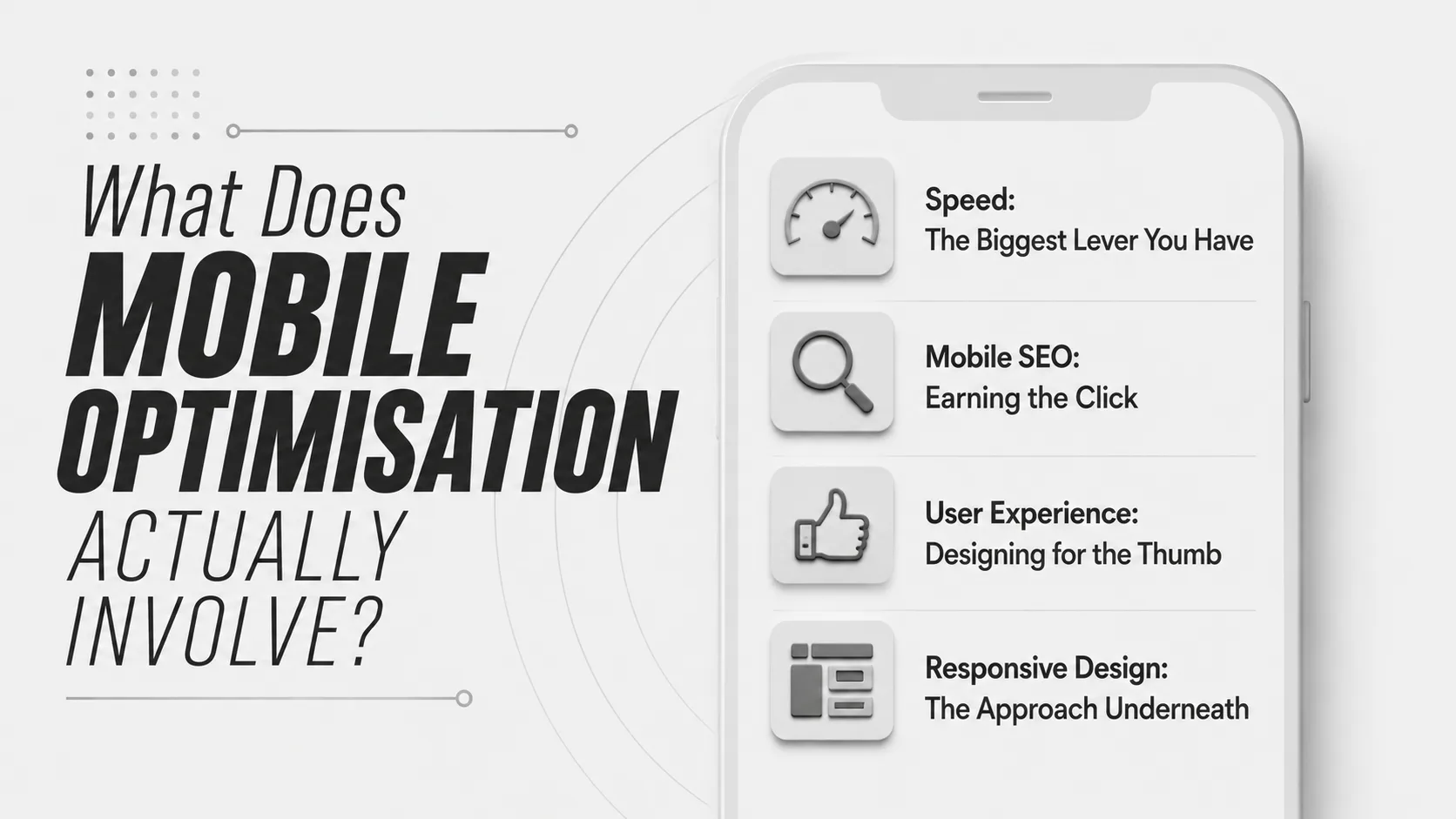
What Does Mobile Optimisation Actually Involve?
The work falls into four areas. Speed. SEO. User experience. And the underlying design approach that ties them together.
Speed: The Biggest Lever You Have
A slow mobile site loses visitors before it loses search rankings. People close the tab. Then Google notices. Five things move the needle on speed.
Compress your images. Images are usually the largest files on a page. Compress them before upload and serve them in modern formats like WebP or AVIF where possible. Keep visual quality and cut file size by a meaningful margin.
Minify your code. Removing whitespace, line breaks, and comments from your HTML, CSS and JavaScript reduces file size without changing what the code does. Smaller files travel faster.
Use a CDN. A content delivery network stores copies of your static files on servers around the world, and serves them from the one closest to your visitor. For Australian businesses, the major CDN networks have edge servers in Sydney and Melbourne, which are faster than serving everything from a single origin.
Keep redirects to a minimum. Every redirect adds a round-trip. One or two is fine. A chain of four or five is a problem, especially on mobile networks where each hop costs noticeable time.
Audit your plugins. Plugins add weight, even when they are not actively doing anything. Every six months or so, look at what you are running and remove what you do not need.
Mobile SEO: Earning the Click
Speed gets you ranked. Good on-page SEO gets you clicked.
Titles and meta descriptions need to do their job at a glance. On mobile search results pages, Google truncates aggressively. A title over about 60 characters will be cut off. A meta description over 155 will be cut off, too. Write the important part first.
Structured data also matters more on mobile. Adding schema markup tells Google exactly what a page is about. A recipe page can show ingredients and cook time. A product page can show price, availability and review stars. Those rich results take up more space on a phone screen and lift click-through rates against plain blue-link competitors.
User Experience: Designing for the Thumb
Once a visitor lands, the experience needs to feel made for them. A few things tend to break first.
Tap targets are the easiest to get wrong. Buttons need to be big enough to tap accurately and spaced far enough apart that nobody fat-fingers the wrong one. Apple recommends a minimum of 44 by 44 pixels, Google says 48 by 48. Either is a reasonable floor.
Navigation needs trimming. Phone screens cannot carry a desktop-style mega menu without it becoming a wall of tiny links. A clear hamburger menu, a search box and one or two key actions in the header are usually enough. For e-commerce, a visible search field, category dropdown and a sensible product grid will outperform a complicated nested menu every time.
Content depth matters too. Three layers deep is a fair rule. Home, category, product. Home, service, sub-service. If your visitor needs to tap five or six times to reach real information, the structure is too complex.
Pop-ups are the fastest way to lose a mobile visitor. The close button is hard to hit, the content blocks the page, and Google penalises intrusive interstitials in mobile search. If you need a pop-up, make it dismissible with one obvious tap and never trigger it on first load.
Body text should be at least 16 pixels on mobile. Smaller looks tidy in a mockup and unreadable on a phone. Line height around 1.5 makes long passages easier to follow. The first CTA should appear early, above the fold if possible, in a contrasting colour, with a label that describes what happens next. “Get a quote” beats “Submit.” “Talk to us” beats “Click here.” And for imagery, wide landscape shots that work on a 27-inch monitor often collapse on a phone, so crop differently for mobile or pick imagery that holds its meaning when scaled down.
Responsive Design: The Approach Underneath
Responsive design is a development approach where a single version of your website adapts its layout to fit any screen size. It works by using flexible grids, fluid images and CSS media queries to rearrange page elements as the viewport changes. We have written more on the benefits of responsive website design if you want a deeper read on the topic.
It is the approach Google recommends and the one most modern sites use, because it removes the need to maintain a separate mobile site. One codebase, one set of content, one URL per page. Everything else is handled by the design.
The alternative, a separate mobile site on a subdomain like m.yourdomain.com, was common a decade ago and is now mostly a maintenance burden. Two sets of code, two sets of content to keep in sync, and a structure Google would rather you simplify.
How Do You Know If Your Site Has a Mobile Problem?
Some signs are easy to spot. Others need a tool.
Open your site on your own phone. Try to find a phone number. Read a paragraph without zooming. Tap the menu, then a sub-menu, then a CTA. If any of that feels awkward, your visitors are feeling it too.
For a more technical view, run a few free tools.
- Google PageSpeed Insights. Gives you a mobile performance score and a list of opportunities to improve.
- Google Search Console. Surfaces crawl errors, indexing issues and search performance for your site.
- Lighthouse, inside Chrome DevTools. Audits performance, accessibility, SEO and best practices in one pass.
If your mobile PageSpeed score is under 50, your site is slow enough to be hurting both rankings and conversion. Anything in the 50 to 90 range has work to do. Above 90 is good.
Common Mobile Optimisation Mistakes
A short list of the things that come up most often when we audit a site for mobile.
- Hero images that are 4 megabytes when they could be 200 kilobytes
- Forms with eight fields when three would do
- Body copy under 14 pixels
- Tap targets that are too close to each other
- Modal pop-ups within five seconds of arriving
- A logo that links to nothing, or a missing home link
- Content that loads after the user has already tried to scroll
- Phone numbers that are not tap-to-call
Each one of these is small on its own. Stacked together, they explain most mobile bounce rates.
Where to Start If You Are Behind
If your site has not been optimised for mobile in a while, do these four things in order. If you are starting from scratch and want a broader view of how to approach a new build, our piece on where to start with web design is a useful companion read.
- Run PageSpeed Insights on your three most important pages.
- Open the same pages on your phone and note anything that feels broken or hard to use.
- Check Google Search Console for mobile usability issues.
- Fix the biggest items first. Usually images, then code, then layout.
Most of the fixes are small. Compress images. Shorten forms. Bump up font sizes. Move the CTA up. An afternoon’s work, no redesign required.
If you have read this far, you already suspect your site has room to improve on mobile. The fastest next step is a proper look at what is actually happening. We can audit your site, identify the issues that are costing you visitors and rankings, and give you a clear order to fix them. And if a full rebuild is on the table, our website design and development team can create a mobile‑friendly experience that sets you up for growth.
Let’s talk responsive websites.