Good website UX design is mostly common sense applied with discipline. People want to find what they came for, do what they came to do, and leave without feeling like they wrestled with the site to get there. When that happens, they come back. When it doesn’t, they go somewhere else.
That’s the whole business case in three sentences. The rest of this post is about what gets in the way of it, and what to do instead.
We’ve been building websites for over 25 years, and the pattern is consistent. The sites that perform aren’t the prettiest or the most technically clever. They’re the ones where every page knows what it’s for, every click leads somewhere useful, and the design gets out of the user’s way.
What Is Website UX Design?
Website UX design is all about shaping the way people experience a site, from the moment they land on it to when they make a purchase, leave, or choose to come back. It works by understanding who your users are, what they’re trying to do, and removing every obstacle between them and that goal.
Visual design, content structure, page flow, interaction design and accessibility are all part of website UX design. It is not the same as visual design, though the two overlap. A website can look beautiful and still be miserable to use. It can also be plain and still feel effortless. UX is what decides which one your visitors get.
Apple, Google and Amazon spend heavily on UX because they treat it as infrastructure. According to Forrester research cited in Forbes, every dollar invested in UX returns up to $100 in measurable benefit. That ratio holds up across most industries when the work is done properly.
Why Website UX Design Pays Off
The business case for website UX design comes down to four outcomes, and they compound.
Failed launches cost more than testing. Most of the truly expensive website rebuilds happen because the first version was shipped without anyone checking how it would actually be used. User testing during design is cheap. Rebuilding eighteen months after launch is not.
Happy users do your marketing for you. A customer who had a good experience is the most credible salesperson you have. They recommend, they review, they return. You spend less on paid acquisition because word of mouth is doing some of the work.
Retention beats acquisition. It costs more to win a new customer than to keep an existing one. A site that’s pleasant to use brings people back.
Conversion goes up when friction goes down. Every unnecessary form field, every confusing navigation choice, every slow page is a place where someone gives up. Remove enough of those, and the conversion rate moves on its own.
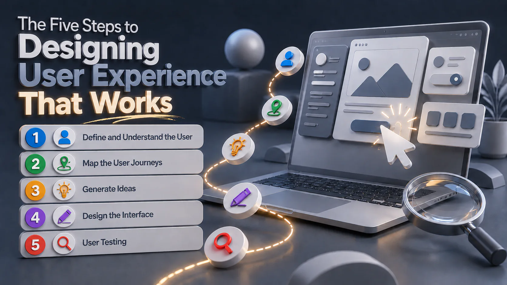
The Five Steps to Designing User Experience That Works
These are the steps we work through on every website project, from a small business refresh to enterprise platforms. The principles are the same regardless of scale.
1. Define and Understand the User
UX starts with the user, not the brief. Before any wireframe gets drawn, you need to know who you’re designing for. That means interviews, surveys, analytics data, and time spent looking at how real people use real websites.
The output is a set of user personas, which represent the different types of people who’ll use the site. Personas keep the design team honest. When someone suggests adding a feature, you can ask which persona it’s for. If the answer is none of them, the feature doesn’t go in.
2. Map the User Journeys
One user wants to buy something. Another wants to find a job. A third wants to check whether you operate in their region. Each one is on a different journey, and the site needs to handle all of them without making any of them feel like an afterthought.
Mapping journeys means thinking through the realistic paths a user takes from landing on your site to completing their goal. Where do they enter? What do they need to see first? Where are they most likely to drop off, and why?
3. Generate Ideas
Once the goals and users are clear, the design team and stakeholders work through ideas together. This is where a lot of bad projects go wrong, because the loudest opinion in the room wins. The better approach is to test ideas against the user research, not against each other.
4. Design the Interface
The design phase moves from rough to refined. Flowcharts show how users move through the site. Wireframes lay out structure and hierarchy without getting distracted by colour or imagery. Prototypes simulate the working product so people can click through it and feel where it works and where it doesn’t.
A wireframe is not a finished design. It’s a thinking tool. Treating wireframes as final is one of the most common mistakes we see in website design projects.
5. User Testing
User testing is where you find out whether the design works for the people it was built for. You ask real users to complete real tasks and watch what happens. The results are almost always humbling. Things you assumed were obvious are not. Things you worry about are fine.
UX design is iterative. Findings from testing feed back into the design, which gets tested again. That loop continues until the experience is good enough to ship.
What “Good” Actually Looks Like
The UX writers Charles Kreitzberg and Ambrose Little described three qualities every well-designed product needs in their Usability in Practice column (MSDN Magazine, 2009). Useful, usable, desirable.
Useful means it solves a real problem. If nobody needs what your site does, no amount of polish will save it.
Usable means it’s easy to use. The Nielsen Norman Group breaks usability into five components. Learnability is how quickly a first-time user gets it. Efficiency is how fast a returning user can get things done. Memorability is whether they can come back a month later and not need to relearn. Errors are how often mistakes happen and how bad they are when they do. Satisfaction is whether using the site is pleasant.
Desirable means it evokes a positive feeling. Aesthetics, tone, personality. A site can be technically usable and still feel cold or generic. Desirability is what makes people choose your site over another that does the same thing.
Why Does Good UX Look So Simple?
Because simplicity is the result of work, not the absence of it. A simple-looking website usually has more decisions behind it than a cluttered one, because every element on the page had to earn its place.
A page that tries to do five things does none of them well. A page with one clear goal and a clear next step almost always outperforms it. That’s not a stylistic preference. It’s how attention works.
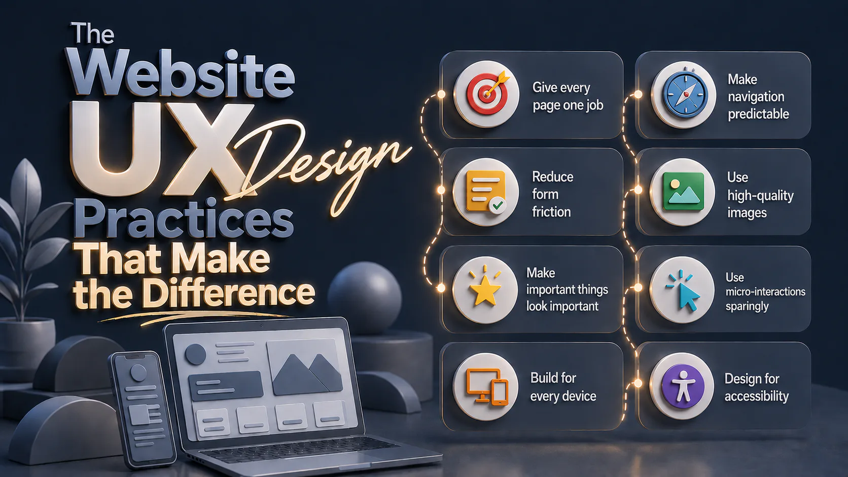
The Website UX Design Practices That Make the Difference
We’ve worked across healthcare, retail, government, education and enterprise. These are the practices that show up in every project that performs well.
Give every page one job. If a stakeholder asks what a page is for and you can’t answer in one sentence, the page needs work.
Make navigation predictable. Users should always know where they are, how they got there and how to get home. Custom navigation patterns almost always cost more in confusion than they win in style points.
Reduce form friction. Only ask for what you need. Auto-fill where you can. Show errors next to the field, not at the top of the page. A checkout that takes seven fields instead of fourteen will convert better, regardless of how nice the design is.
Use high-quality images. Blurry, low-resolution images make a site feel careless, regardless of how good the rest of the design is. Where possible, use real photography of your own products, your own people and your own spaces. Real photography helps a site feel specific to your business rather than generic.
Make important things look important. Headlines should be clearly headlines. Buttons should be clearly buttons. Critical content should not look the same as decorative content. Visual hierarchy is the difference between a user finding the thing and not.
Use micro-interactions sparingly. A button that subtly responds when you hover over it tells the user it’s interactive. A homepage where seven things are animating at once tells the user to leave.
Build for every device. Responsive design is no longer a premium feature. Mobile devices account for around half of all web traffic in Australia (StatCounter, 2025), and a site that ignores that is leaving money on the table. Thumb zones, tap targets, line length, scroll behaviour. They all matter.
Design for accessibility. Adequate colour contrast, readable fonts, image alt text, content broken into digestible chunks. Accessibility is not a niche concern. It improves the experience for everyone, and in many sectors it’s a legal requirement.
A Real Example: UX Lighthouse / Navigate Portal
When we built the UX Lighthouse / Navigate Portal on the OutSystems platform, the brief was to deliver a complex enterprise tool that didn’t feel like one. The user base ranged from highly technical to not technical at all, and the system had to serve both without compromising either.
The UX work came first. We mapped the journeys for each user type before any interface design started, then tested prototypes with real users from each group. The build came in on time, and the platform handled adoption without the usual training overhead that enterprise tools demand.
That’s what good user experience design does. It makes the complicated feel manageable.
Where to Start
The honest answer is to look at your site the way a first-time visitor would. Open it on your phone. Try to complete the things your customers come to do. Notice every moment of friction. Then fix the worst three.
If you’d rather have a second set of eyes on it, that’s what we do.