Your website images are doing one of two things. They’re either helping you sell, or they’re slowing the page down, looking like everyone else’s, and quietly draining trust. There is no neutral image on a website.
Knowing how to choose website images is a practical skill, not an artistic one. It’s about picking pictures that suit your brand, load quickly on every device, and give the reader a reason to keep scrolling. This post walks through five tips that cover both sides of that job, the creative call and the technical one, so the images on your site actually pull their weight. If you want the broader case for why visual decisions matter, our take on why design matters is worth a read alongside this one.
Why Image Choice Matters More Than People Think
Images are usually the heaviest assets on a web page. According to the HTTP Archive Web Almanac (2024), images account for around 40% of total page weight on a typical site. That means image choices directly affect load speed, Core Web Vitals, and how Google ranks the page.
They also do the heavy lifting on first impressions. A reader decides whether to stay on a page in a few seconds, and what they see matters more than what they read in that window. So image selection is both a brand decision and a performance decision.
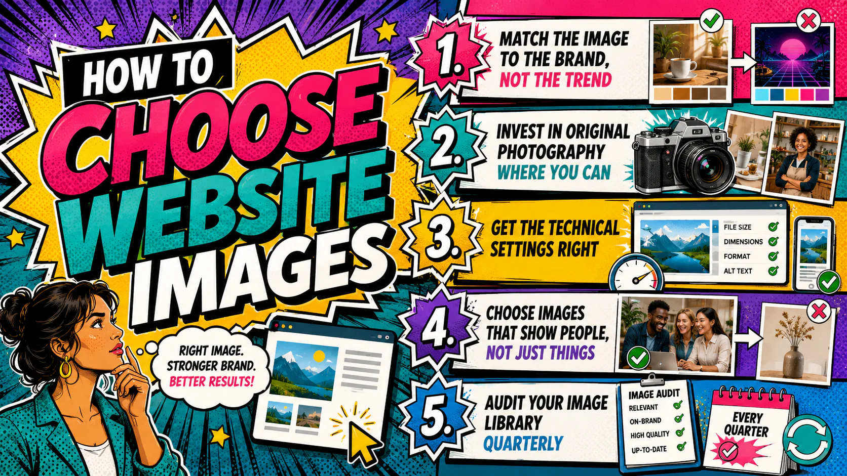
How to Choose Website Images
The five tips below cover both brand and performance considerations when choosing images for your website.
1. Match the Image to the Brand, Not the Trend
The first filter is fit. Before sizing, sourcing or compressing, ask whether the image actually belongs to your brand.
A polished, considered photo of a quiet workspace says one thing. A bright, busy shot full of people mid-laugh says something completely different. Neither is wrong. They’re just for different brands. Your job is to know which one you are and pick accordingly.
A few practical checks before approving an image:
- Does the colour palette sit comfortably with your brand colours, or fight them?
- Does the mood match the tone of the copy on the page?
- Could a competitor use this exact image without changing a thing? If yes, keep looking.
Trend-driven imagery dates fast. Brand-aligned imagery lasts. A consistent visual style across the site is worth more than any single “wow” shot, and it’s one of the easiest design mistakes to avoid on your website.
2. Invest in Original Photography Where You Can
Original photography is custom imagery shot specifically for your business, your products and your people. It works by giving you images no competitor has, full ownership of the files, and the freedom to use them across web, social, print and ads without licensing concerns.
It costs more upfront but pays off in two ways. The first is differentiation. Stock photos show up on hundreds of other websites, and readers notice, even if they can’t articulate why something feels generic. The second is consistency. A shoot briefed properly gives you a library that matches your brand colours, your products and your environment in a way no stock site can. We see this play out on every website design project we take on.
When briefing a photographer, give them:
- A clear shot list (people, product, environment, detail)
- Brand colours and any visual references you like
- The end use for each image (hero, supporting, social crop)
- Required orientations and rough aspect ratios
If a full shoot is out of reach, consider a half-day for hero images and headshots, then supplement with carefully chosen stock. The headshots in particular earn their keep. People connect with faces, and a real face beats a stock model on every measure that matters.
3. Get the Technical Settings Right
This is where most websites go wrong. The image looks fine in the design file, then ends up on the live site as a 4MB JPG that takes three seconds to render. Loading speed is a ranking factor, and large images are the single most common cause of slow pages.
A workable checklist for every image before it goes live:
- Format. Use WebP or AVIF for photos where possible. Fall back to JPG for photos, PNG only when you need transparency, and SVG for logos and icons.
- Dimensions. Export at the largest size the image will display on screen, not larger. If your hero is 1600px wide at the desktop breakpoint, export at 1600px, not 3000px.
- Compression. Aim for under 200KB for hero images, under 100KB for supporting images. Tools like Squoosh, TinyPNG, ImageOptim, or SquishMate do this well without visible quality loss.
- Responsive sizes. Serve smaller versions to mobile devices using the
srcsetattribute or your CMS’s built-in responsive image handling. WordPress does this automatically with most modern themes. - Alt text. Every image gets descriptive alt text. This is for accessibility first, SEO second, and it should describe the image, not stuff in keywords.
- File names. Rename
IMG_4827.jpgto something likeoffice-team-meeting-brisbane.jpgbefore uploading. Google reads file names.
If you’re not sure what sizes your site needs, your developer can give you a spec sheet. Use it. Guessing is how you end up with a slow site.
4. Choose Images That Show People, Not Just Things
Faces win attention. Eye-tracking studies have shown for years that human faces in web imagery draw the eye first, before headlines, before products, before buttons. If you sell a product, show someone using it. If you sell a service, show the people who deliver it.
This doesn’t mean every image needs a person in it. Negative space, product detail and environment shots all have their place. But across a page, a section, or a homepage, faces should feature.
Practical applications:
- Hero images with a person in them tend to outperform pure product or scenery shots on engagement metrics.
- Testimonial sections with real client headshots feel more credible than text alone.
- “About us” pages without team photos make readers wonder what’s being hidden.
One caveat. Stock photos of people who aren’t actually your people often read as fake, and savvy readers can spot it. If you’re going to show faces, real ones are better than stock ones almost every time.
5. Audit Your Image Library Quarterly
The job isn’t done at launch. Image quality drifts over time. Staff change, products change, a new logo comes in, a campaign image gets reused once too often. Without a regular audit, the site ends up with a mix of old and new that erodes the brand without anyone noticing.
A simple quarterly audit:
- Open the site fresh and screenshot the key pages.
- List every image that feels out of date, off-brand or low quality.
- Check file sizes on the heaviest images using your browser’s network tab.
- Flag any image showing a former staff member, a discontinued product or last year’s campaign.
- Replace the worst offenders first. Don’t try to redo everything at once.
A site with 20 strong images beats a site with 200 mediocre ones. Pruning is part of the job.
How to Choose Website Images: A Quick Comparison
| Approach | Cost | Time to Implement | Brand Consistency | Best For |
|---|---|---|---|---|
| Custom photography | High upfront | 2 to 6 weeks | Strong | Brand-defining pages, headshots, hero imagery |
| Premium stock (paid) | Moderate | Same day | Moderate | Supporting imagery, blog posts, ad creative |
| Free stock libraries | Free | Same day | Low | Internal content, drafts, low-traffic pages |
| AI-generated imagery | Low | Same day | Variable | Conceptual or illustrative imagery, with caution |
| User-generated content | Low | Ongoing | Moderate to strong | Social proof, community-driven brands |
The right approach is usually a mix. Custom photography for the spine of the site, premium stock for the rest, and a periodic review to keep it all on brand.
Before you upload another image
Image choice is one of the few areas of a website where small, considered changes give immediate, visible results. A page with the right images, sized properly and served fast, looks like a different page from one with the wrong images sized wrong. The work isn’t glamorous, but the difference is obvious.
If your site needs a hand getting there, whether that’s a full visual refresh, a tighter image library, or just a faster, leaner front end, we’re around.