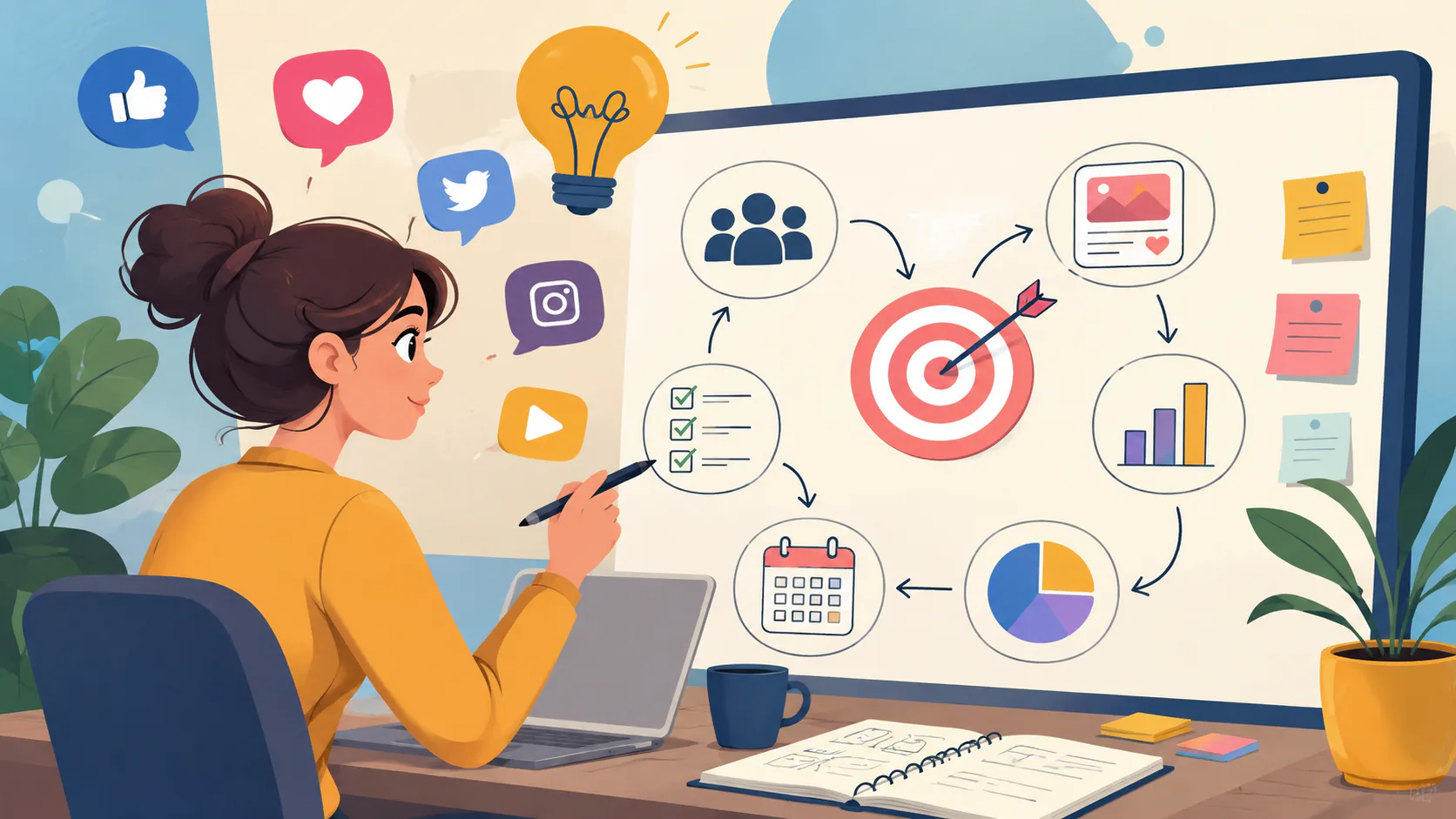
Looking at existing design work to spark ideas for your own. If you’re hunting for web design inspiration, there are plenty of sites to explore. The six below are the ones we keep coming back to. Pinterest, Behance, Dribbble, Awwwards, SiteInspire and Mobbin.
What Makes a Good Source of Web Design Inspiration?
The best sources have three things in common. They’re well-curated, so you’re not wading through a lot of filler to find the good stuff. They’re searchable or filterable, so you can find what you need in under a minute. And they show real work, not just concepts that look polished but would fall apart in front of a user.
A wall of award-winning microsites is fun, but it won’t help you design a B2B service site that needs to convert. Match the source to the job.
A second thing worth saying. Inspiration is not the same as imitation. The point of looking at other work is to pull ideas apart. What’s working, what’s the underlying principle, what could you adapt for your own context? Copying a site you like and changing the colours is not design work.
Portfolio Platforms: Behance and Dribbble
Behance and Dribbble are portfolio platforms first, inspiration sources second. Designers post their work to attract clients, build a reputation, and get hired. That’s worth keeping in mind, because it shapes how you should treat what you find there.
The honest etiquette. Look, learn, and credit. If a designer’s work directly inspires something you’re making, credit them. If their work matches what you actually need, hire them. Don’t lift their visual language wholesale and pretend you arrived at it yourself.
1. Behance
Behance is Adobe’s portfolio platform. Designers post full case studies, including the brief, the process, and the final output. It’s where you go when you want to see how a problem was solved, not just what the end result looked like.
The case study format makes it especially useful if you’re trying to understand a brand identity system or a multi-screen product, rather than just admiring a homepage. In our experience, it’s also the best source for finding the thinking behind work, which matters far more than the surface.
Best for case studies, brand systems, and portfolio-style research.
2. Dribbble
Dribbble is the snapshot version of Behance. Short, polished shots of in-progress work or finished pieces. It’s fast to scan and useful when you need to see a hundred takes on something specific like a login screen, a dashboard widget or a pricing page.
The trade-off is that Dribbble shots are often beautiful but rarely shipped as-is. Treat it as a source of micro-inspiration. Gradients, typography pairings, button styles, motion details. Less useful for whole-page references.
Best for UI details, micro-interactions, and quick visual ideas.
Curated Galleries: Awwwards and SiteInspire
Curated galleries work differently. A third party (editors, curators, juries) picks what gets featured. The designers themselves usually have no commercial stake in the showcase. The standard is set by the curators, which means the bar is consistent but the agenda is theirs, not yours.
3. Awwwards
Awwwards showcases the high end of web design. Sites that win Site of the Day here tend to push what’s technically possible on the web. Heavy use of motion, 3D, scroll-driven interactions, clever transitions.
Use it with a grain of salt. A lot of Awwwards winners are agency portfolios, fashion brands, or campaign microsites where the goal is to impress, not to convert. If you’re designing a healthcare portal or an accounting firm’s site, the lesson is in the craft, not the literal style. Look at how things are executed, not what’s being executed.
Best for pushing the ceiling on what’s possible, and for motion and interaction design.
4. SiteInspire
SiteInspire is a long-running, well-curated gallery of website design. It’s tag-based and filterable by style, type and subject. The bar for inclusion is high. Less flashy than Awwwards, more disciplined than Dribbble.
It’s the site we use when a client says, “Show me what good looks like in our industry.” You can filter by sector (restaurants, fashion, finance, technology, education) and quickly build a reference set that’s actually relevant to the project, not just visually interesting.
Best for industry-specific reference work and well-built sites that aren’t trying to win prizes.
Pattern Libraries: Mobbin
Pattern libraries do something the others can’t. Instead of showing you what designers want to make, they show you what shipped products actually look like in the wild. That makes them the most practical category on this list.
5. Mobbin
Mobbin is a searchable library of user interface screens from live applications and websites. The catalogue contains hundreds of thousands of screens from numerous real products.
Why it matters. Searching for “onboarding flow” or “settings screen” returns dozens of real-world examples in seconds. These are patterns users have already encountered in other apps, which means they’re familiar by default. If you’re designing a product where usability matters more than visual novelty, and that’s most products, Mobbin is the strongest reference source going.
Best for product UI patterns, real shipped work, and finding precedents for specific screens.
General Visual: Pinterest
Pinterest doesn’t fit cleanly into a portfolio, gallery or pattern library. It’s broader, looser and useful for a different stage of the process.
6. Pinterest
Pinterest is the most flexible tool on the list. It covers everything from web layouts to typography, colour palettes, photography styles and brand identity work, even physical things like packaging and signage. You search loosely, save what catches your eye, and organise it into boards by client, project or theme.
We use private boards a lot at the start of a project. A brief comes in, and within an hour, we’ve got a mood board the team can react to before anyone opens Figma. If you want to see how we use it, our public boards are at pinterest.com/mettrodigital.
Best for early-stage moodboarding, broad visual research, and client conversations.
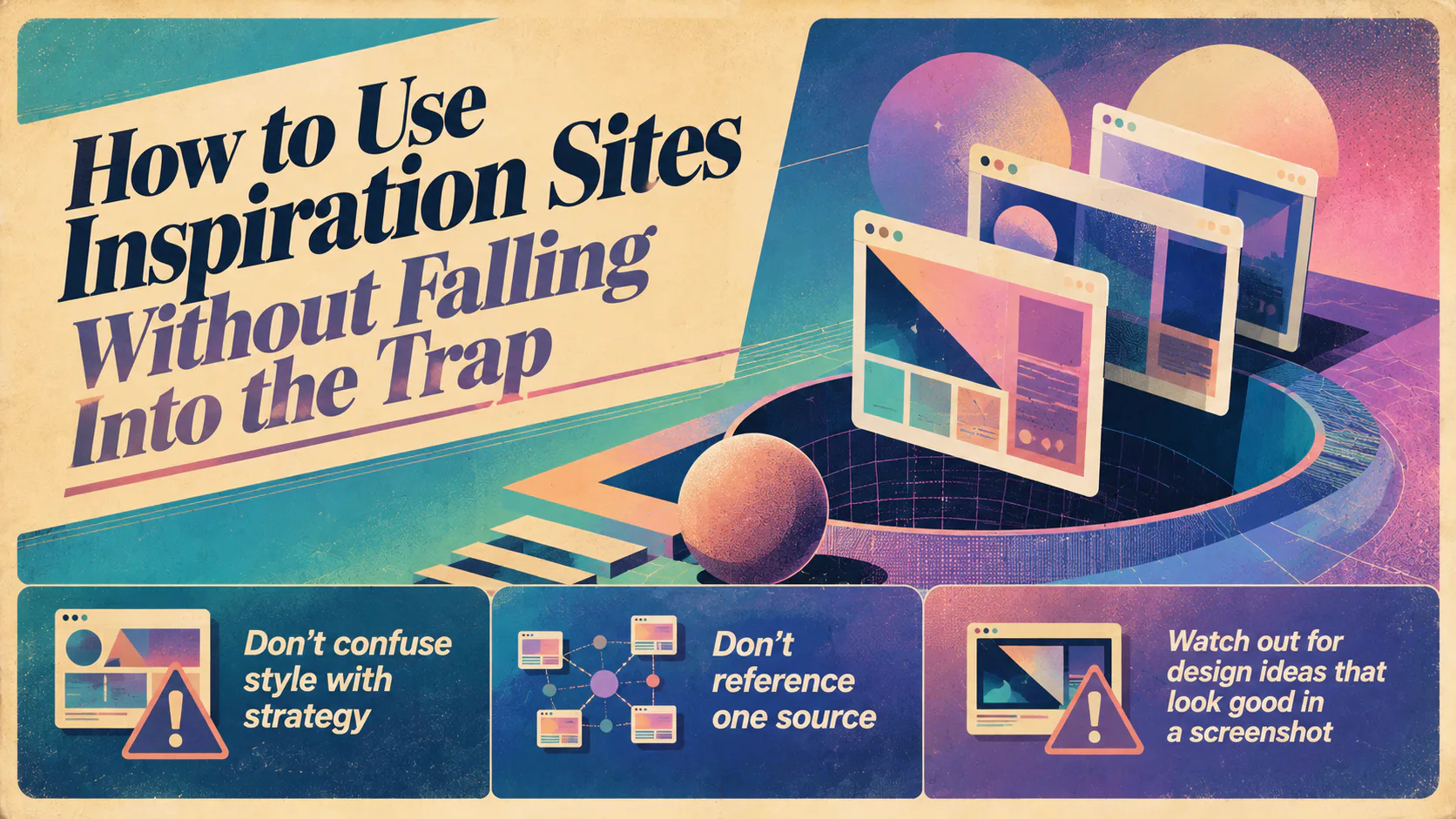
How to Use Inspiration Sites Without Falling Into the Trap
Three things to watch for.
Don’t confuse style with strategy. A site can be beautiful and a commercial failure. Before you reference something, ask what job that site is doing and whether your site has the same job to do. A direct-to-consumer fashion brand and a B2B SaaS product have almost nothing in common, no matter how good they both look.
Don’t reference one source. If everything in your mood board comes from Awwwards, your design will look like everything else on Awwwards. Pull from at least three or four different places, including some that aren’t strictly web design, like magazines, signage, book covers and packaging. Variety produces work that doesn’t look derivative.
Watch out for design ideas that look good in a screenshot. A hero with a six-word headline looks gorgeous on Dribbble and tells a real visitor nothing about what the company does. We’ve written before about design mistakes that quietly hurt a website, and most of them come from prioritising aesthetic over clarity.
Inspiration Is Everywhere, Not Just Online
The six sites above are what we use most, but some of the best reference material has nothing to do with the web. Print magazines, gallery exhibitions, restaurant menus, film title sequences, and packaging design. Anywhere people have made deliberate decisions about how something looks and reads.
Get into the habit of taking photos of things you notice. A typeface on a sign, a colour combination in a shop window, the way a book’s interior is laid out. Over time, you build your own private inspiration archive, which is more useful than any public gallery because it’s filtered by your own taste.
If you’re about to commission a website and you want it grounded in good thinking, not just whatever was trending on Dribbble that month, talk to us about your website.