The Background
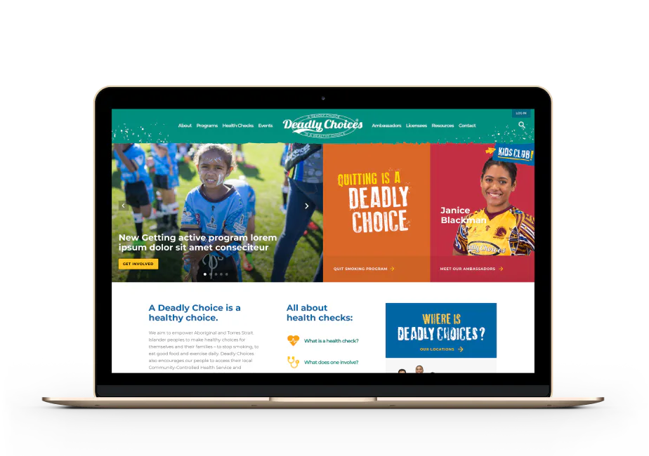
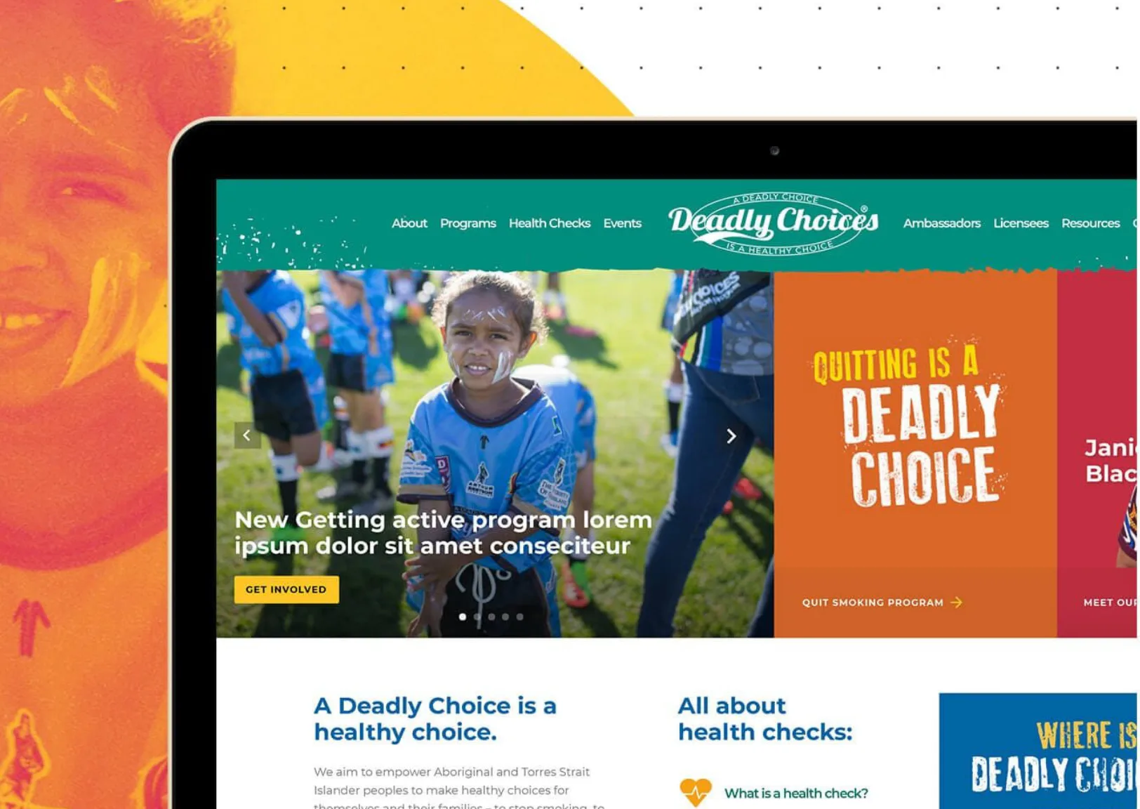
This one’s a throwback, and we’re not pretending otherwise. The Deadly Choices website was built for the Institute for Urban Indigenous Health’s flagship health initiative, targeting young Aboriginal and Torres Strait Islander Australians. Meaningful brief, great client, and a project that pushed us creatively.
They came to us with a refreshed brand identity and needed a digital presence to match: engaging, educational, and built for a young audience. We already knew them well from a previous intranet project, so we hit the ground running and spent more time building than briefing. The site has since been superseded. But the work holds up, and we wanted it in the portfolio anyway.
The Challenge
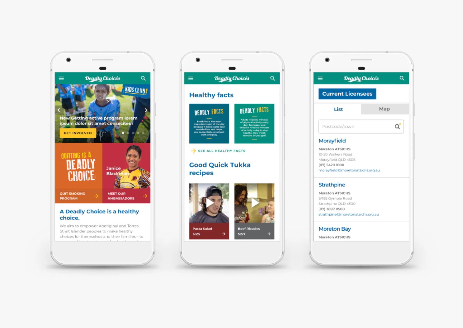
The client required a budget-conscious solution that would not only meet their immediate needs but also allow for future growth and evolution. Additionally, they aimed to create a user experience that resonated with younger audiences, ensuring the site would effectively engage and attract this demographic. We wanted to give our client the ultimate flexibility, allowing them to manage the site independently.
Our Approach
We focused on building a component-driven WordPress website that would allow the client to take control of their content. Rather than having pages of pure text, our client could grab the target audience’s attention by putting several components on a page.
Seeing the type of content that would need to be on the site helped us understand what our client was trying to achieve, and then we were able to break it down into manageable components.
We conducted UX workshops with the client to align on audience needs and site goals, and iterated our plan based on the results. We then presented the architecture, wireframes, and blueprint strategies back to the client before designing the user interface, ensuring they were satisfied.
We also recommended that our client migrate their site to WP Engine, a platform specifically designed for WordPress. This move streamlined their deployment process, allowing for a quicker launch. Additionally, having a dedicated staging server made our workflows more efficient throughout the process.
The Outcome
The finished site gave IUIH full control over their content without relying on developers for day-to-day updates. The component-driven build meant the team could add and rearrange page elements as the campaign evolved. Migration to WP Engine streamlined deployment and cut launch time. The site held up as the Deadly Choices brand grew.
Why It Worked
This project succeeded because every element was grounded in clarity, collaboration and strategic intent. Our longstanding relationship with the client provided a head start, grounding the work in trust, a shared context, and a clear understanding of audience needs. From there, we developed an audience-first UX strategy that was responsive and iterative, enabling us to refine the experience based on user feedback. What emerged was a solution shaped by insight and collaboration.