The Background
Arrow’s brand was functional, but no longer fully reflected who they were or where they were heading. Mettro led a full strategic refresh, including workshops, a communications audit, tone of voice work, and visual direction, that gave Arrow’s team a consistent way to communicate across every channel.


The Challenge
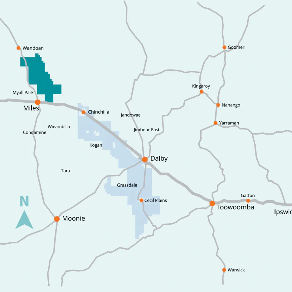
Arrow Energy is a major player in Australia’s gas sector, backed by Shell and PetroChina, with deep operational roots in Queensland’s Surat Basin. Known for operational scale, technical expertise, and regional partnerships, Arrow had a brand that worked, but no longer matched the business behind it.
The existing brand felt outdated and overly constrained. There was misalignment between the corporate identity and how Arrow was perceived externally. Communication leaned heavily on formal, jargon-thick language. Brand values were defined but weren’t translating into everyday communication in usable ways. Teams had limited tools for communicating with warmth, clarity, and consistency. A rally cry, “Go Further,” had been adopted but wasn’t being used consistently or meaningfully, so its meaning had become diluted.
What Arrow needed wasn’t a logo or a colour palette. It was a cohesive strategic foundation the brand could be carried forward on.
Our Approach
Mettro was engaged through a long-standing working relationship with Russell Morris, Principal Design and Digital at Arrow. To bring a broader strategic lens, Mettro partnered with Kellie Penridge from Strong Advice, whose corporate affairs and stakeholder engagement background added depth to the refresh.
The work was approached holistically. Collaborative workshops, interviews, and a full audit of Arrow’s communication ecosystem surfaced what the brand actually stood for and where it was breaking down. The team explored Arrow’s unique place in the market, what made the brand meaningful to internal and external stakeholders, how values could be defined in more usable and expressive ways, the tensions between technical messaging and human storytelling, and the need for more authenticity and voice across every touchpoint.
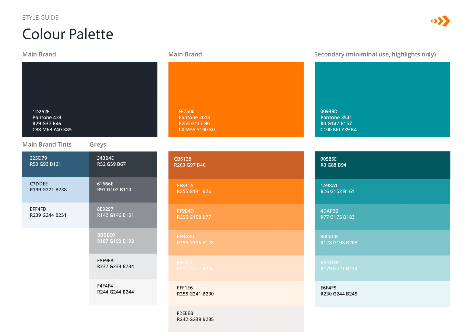
The deliverables included a brand audit report with insights and practical recommendations, a refreshed brand proposition and future-facing narrative, a refined set of brand values and tonal attributes, and visual and tonal guidance designed to unify communications without limiting flexibility.
On “Go Further,” Mettro advised stepping back temporarily. It wasn’t being used consistently, and its meaning had been diluted. The focus shifted to grounding the brand in clarity and capability first, with the option of reintroducing “Go Further” later when it could land with intention.

The Outcome
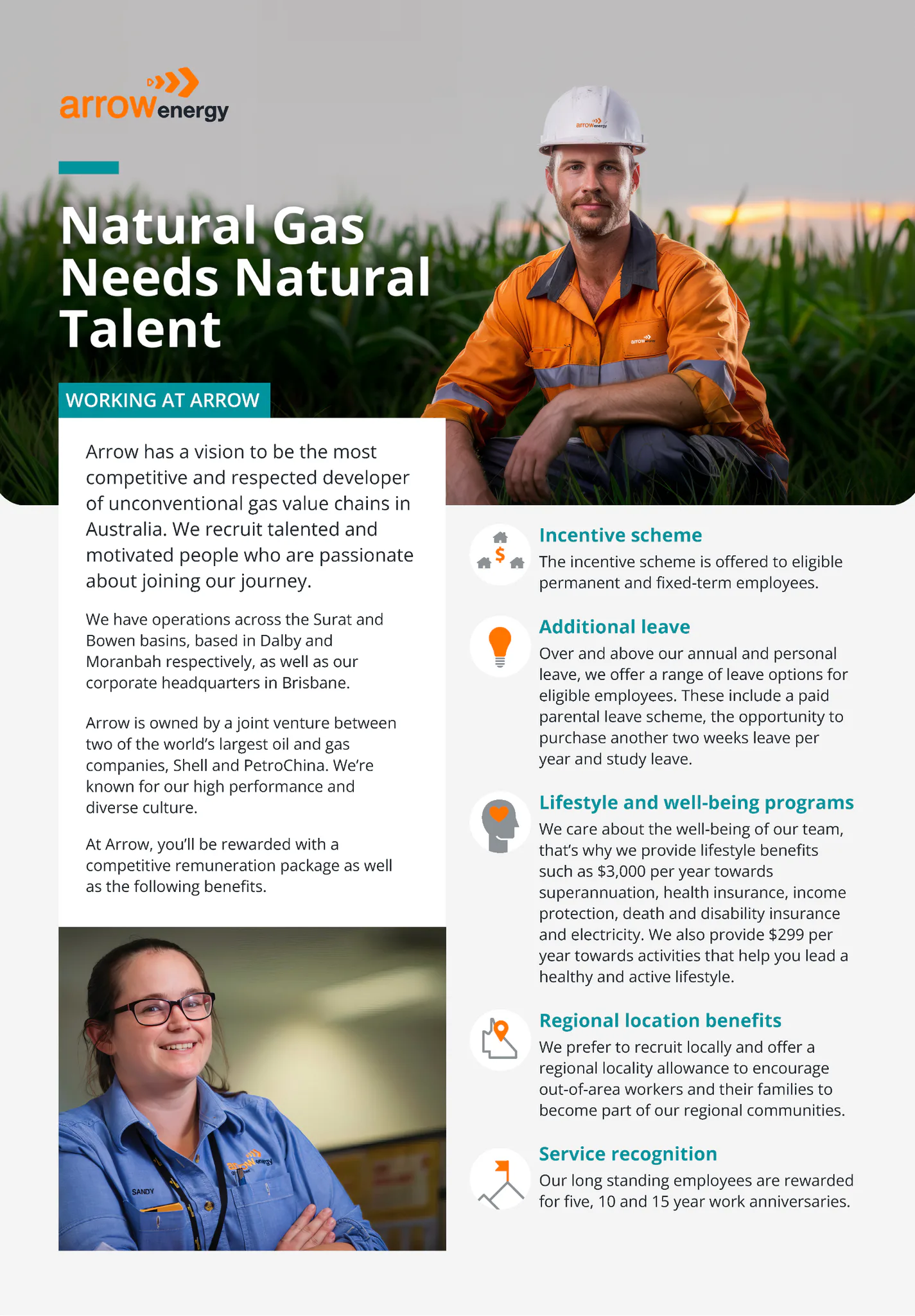
The ripple effects were immediate. Arrow Energy relaunched its website with the refreshed brand applied. Internal communications were updated to reflect the new tone of voice. External messaging became more cohesive, confident, and clear. Teams embraced the new guidelines as tools, not constraints. Stakeholders began to experience a more human, grounded, and consistent Arrow.
With new language, frameworks, and direction in hand, the team could speak with authenticity and plan with confidence.
If your brand has drifted from the business behind it, get in touch to talk through a refresh. You can also see how Mettro approaches digital strategy for clients working through the same kind of clarity problem.